Visual Identities
From the world’s most expensive footballer to an indie rock band, these visual identities are built around bold, memorable symbols. Each design strips away the excess to focus on simple, striking visuals that leave a lasting impression —whether on a global stage or in underground culture.
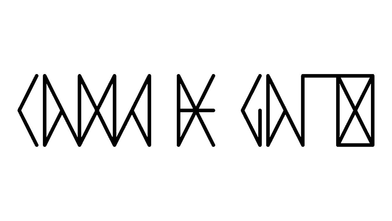
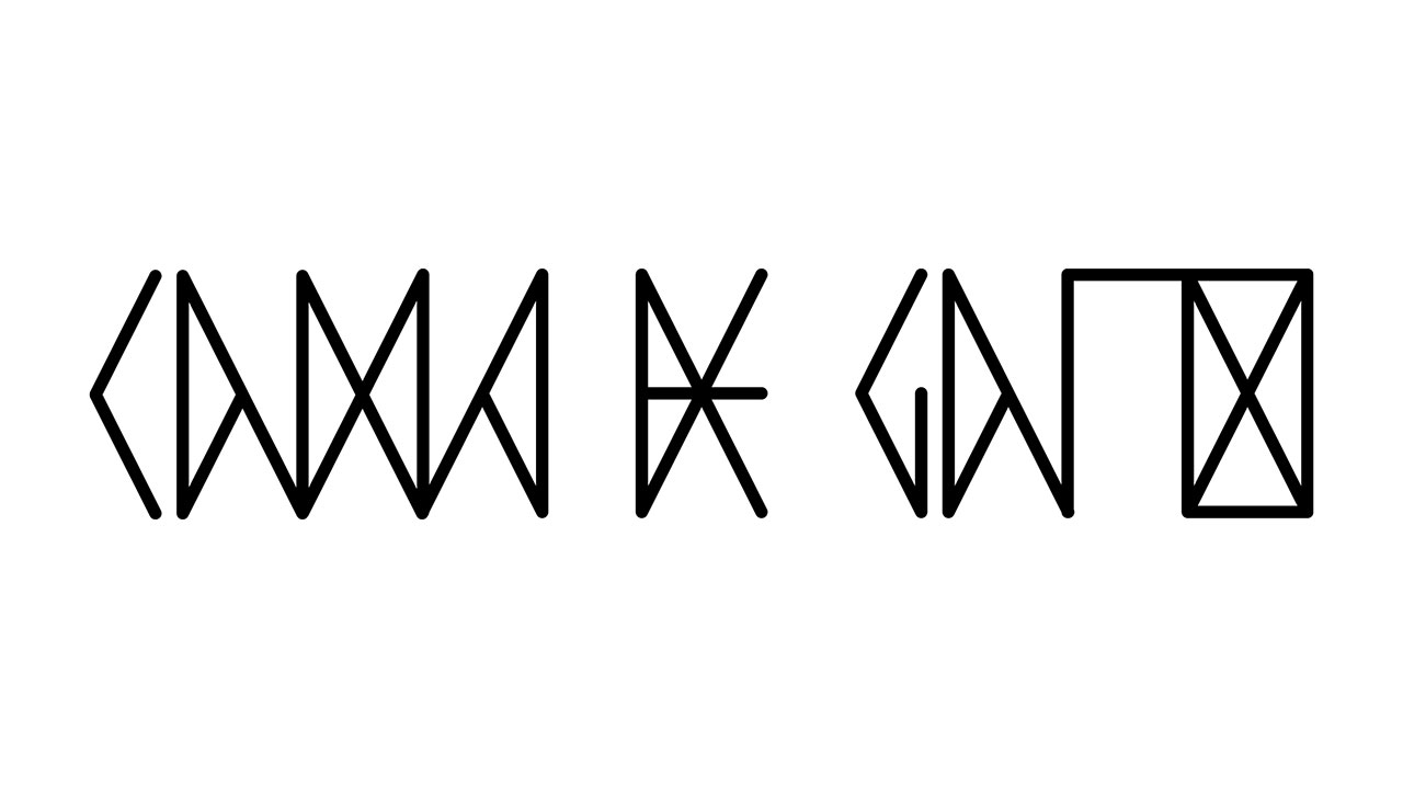
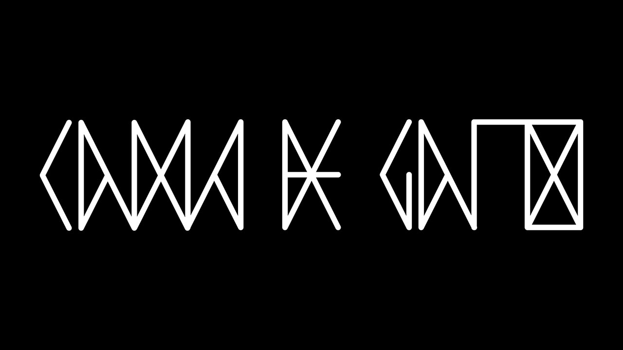
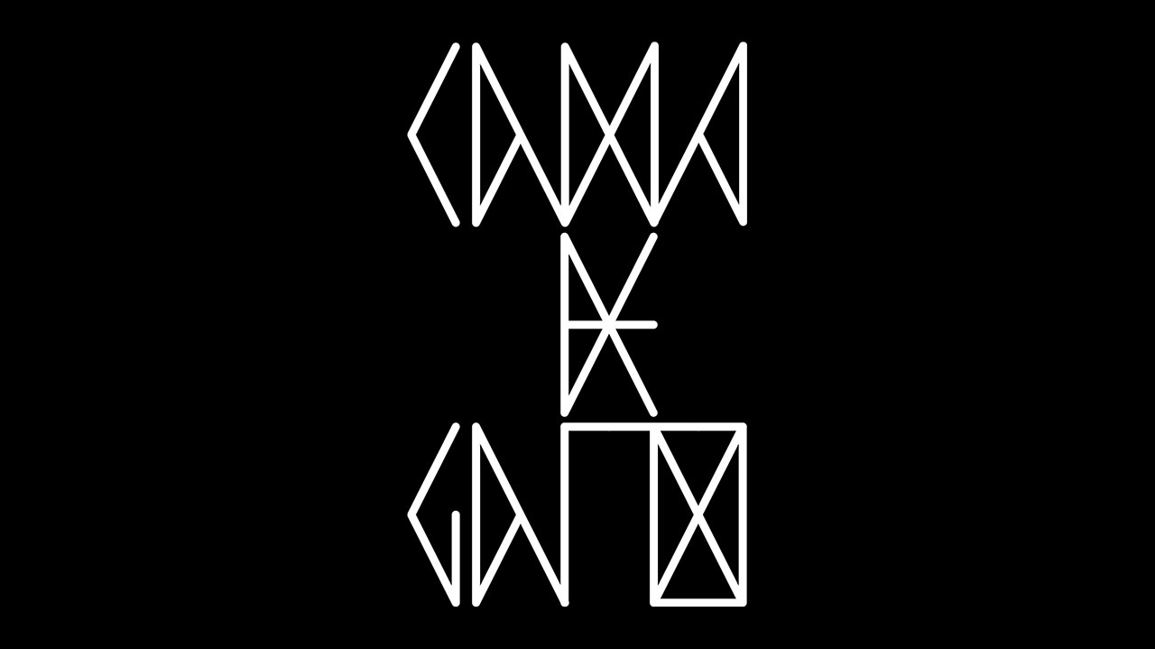
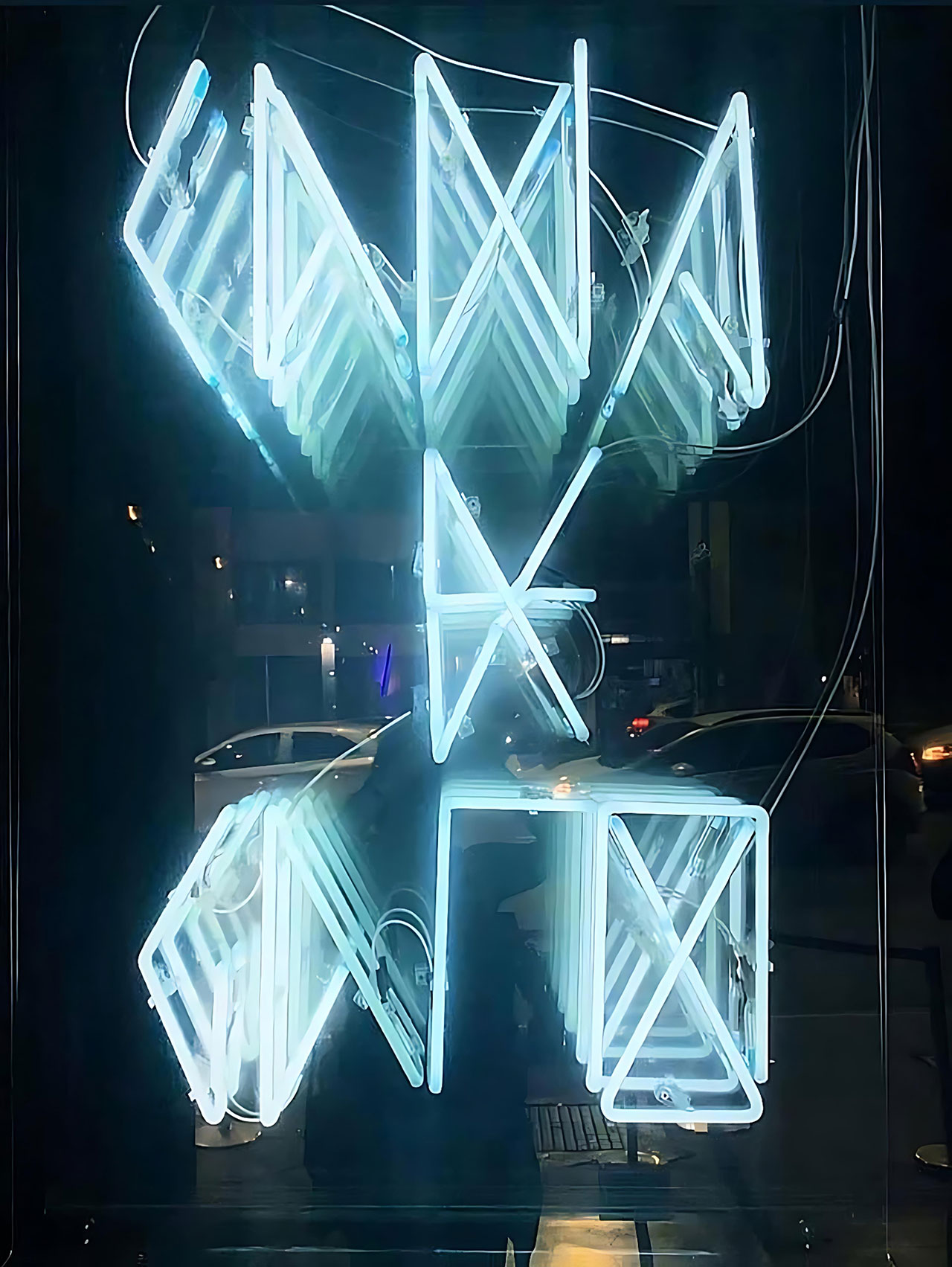
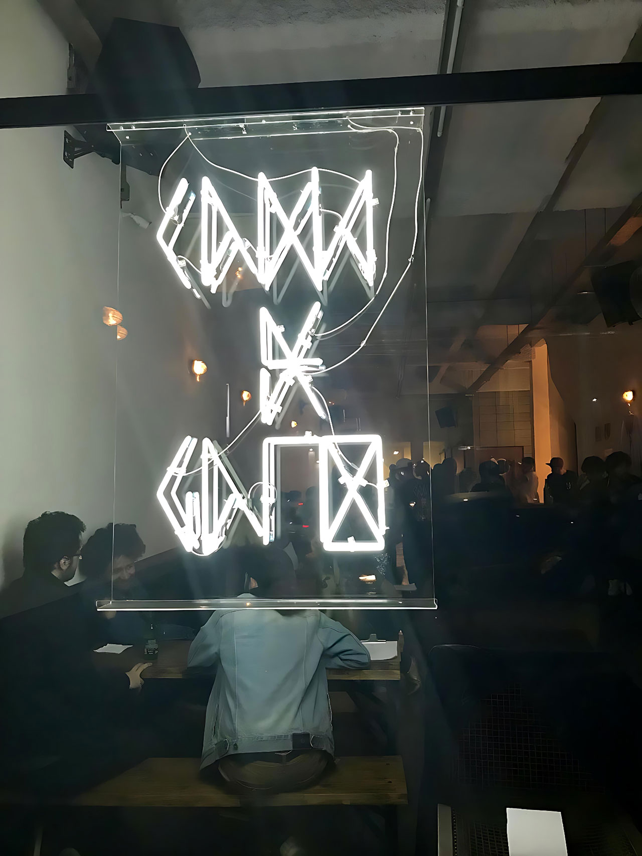
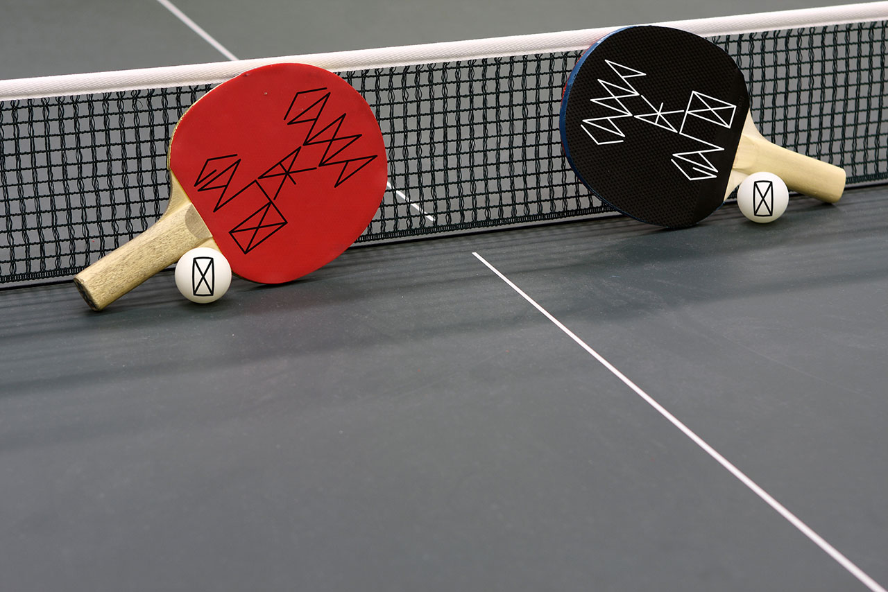
Cama de Gato
2018
–
Role:
Graphic Design
Work done @
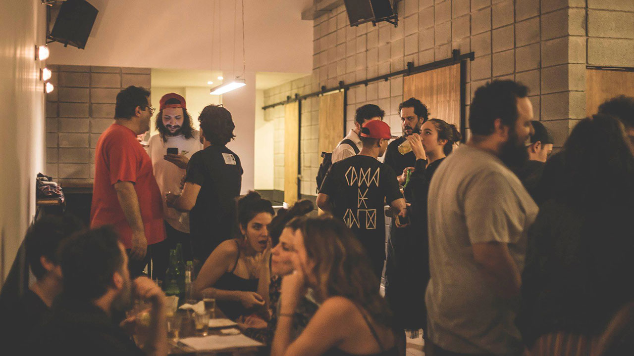
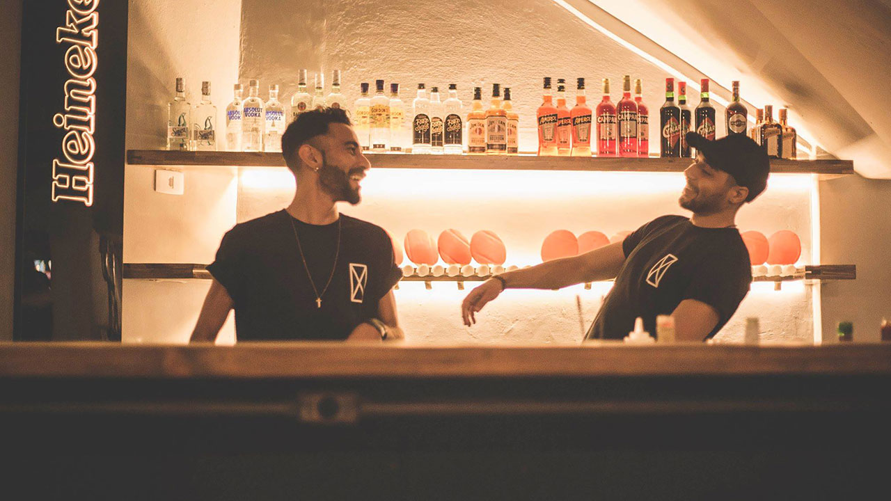
Cama de Gato is a Brazilian bar housed in a repurposed industrial space beneath the Minhocão flyover, known for its communal setup featuring ping-pong tables, large wooden benches and a playlist rooted in punk, rock, and indie genres. Guests often play table tennis for free, creating a lively and welcoming spot for friends to gather.
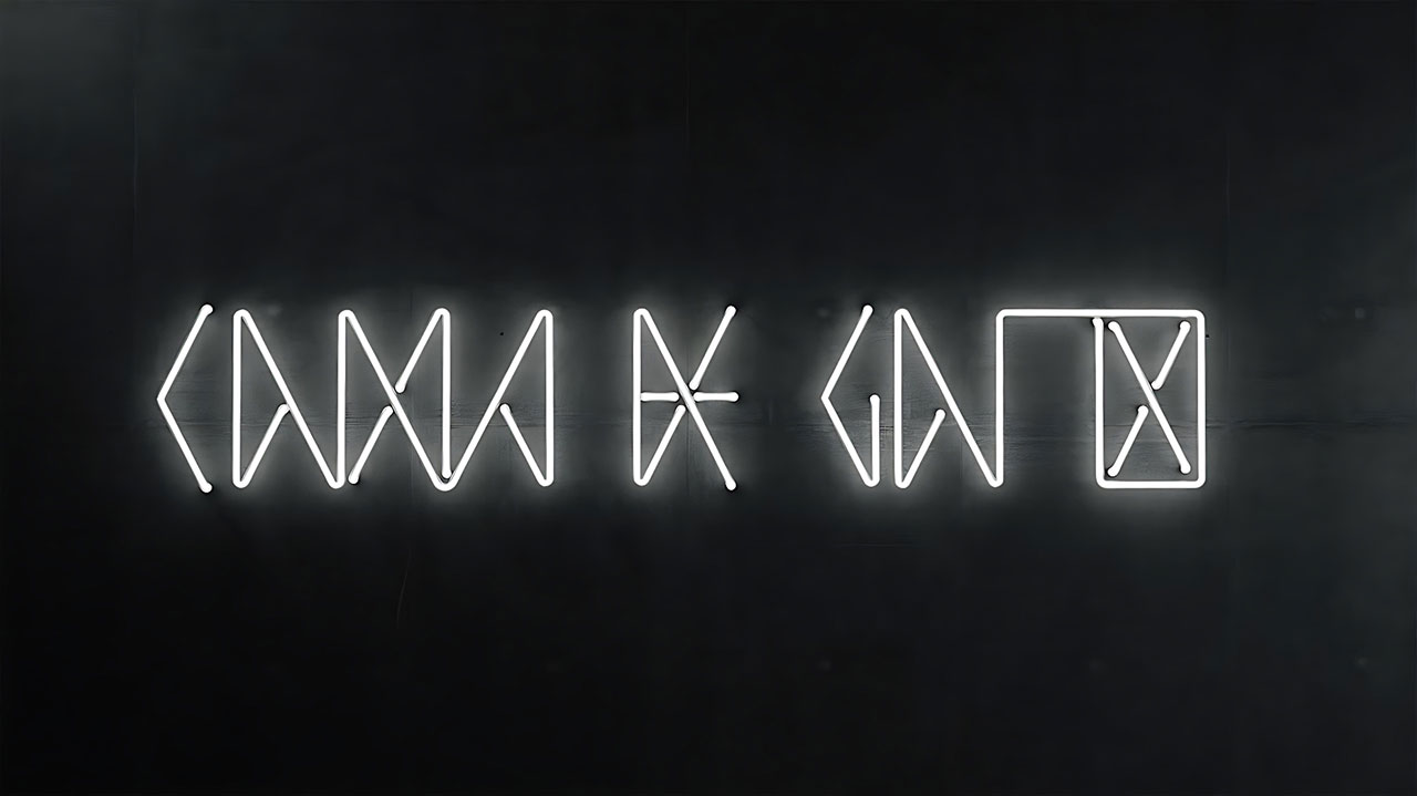
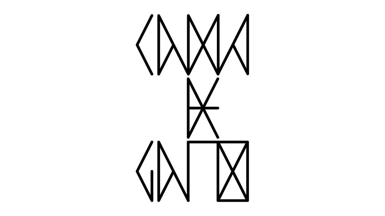
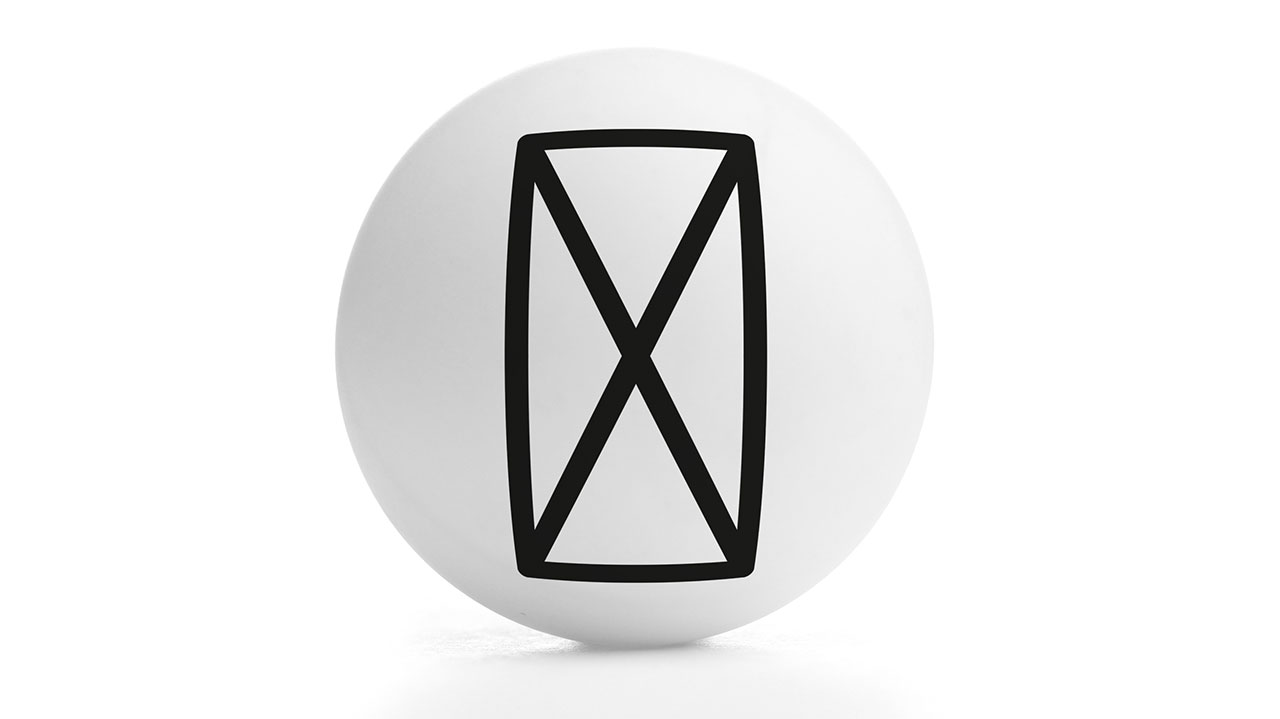
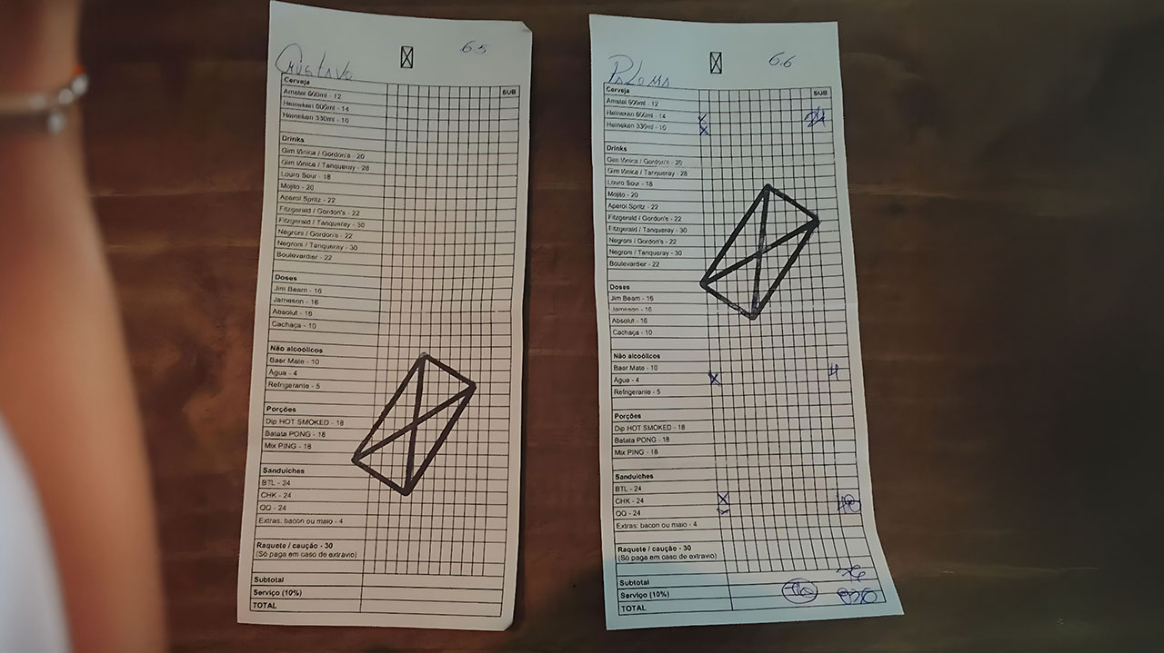
The bar’s visual identity ties its name Cama de Gato (meaning “cat’s cradle”) to the ping-pong experience. There is a visual resemblance between the string patterns of the traditional cat’s cradle game and the nets used in table tennis. This connection serves as a constructive principle, fusing the bar’s name and atmosphere visually.
Given the length of the name, a standalone geometric symbol was proposed for use in small applications like ping-pong balls. Neon signage on the facade complements the nightlife vibe, while the bar’s branding features simple, minimalistic and mostly monochromatic layouts that align with its understated, no-frills ambiance.

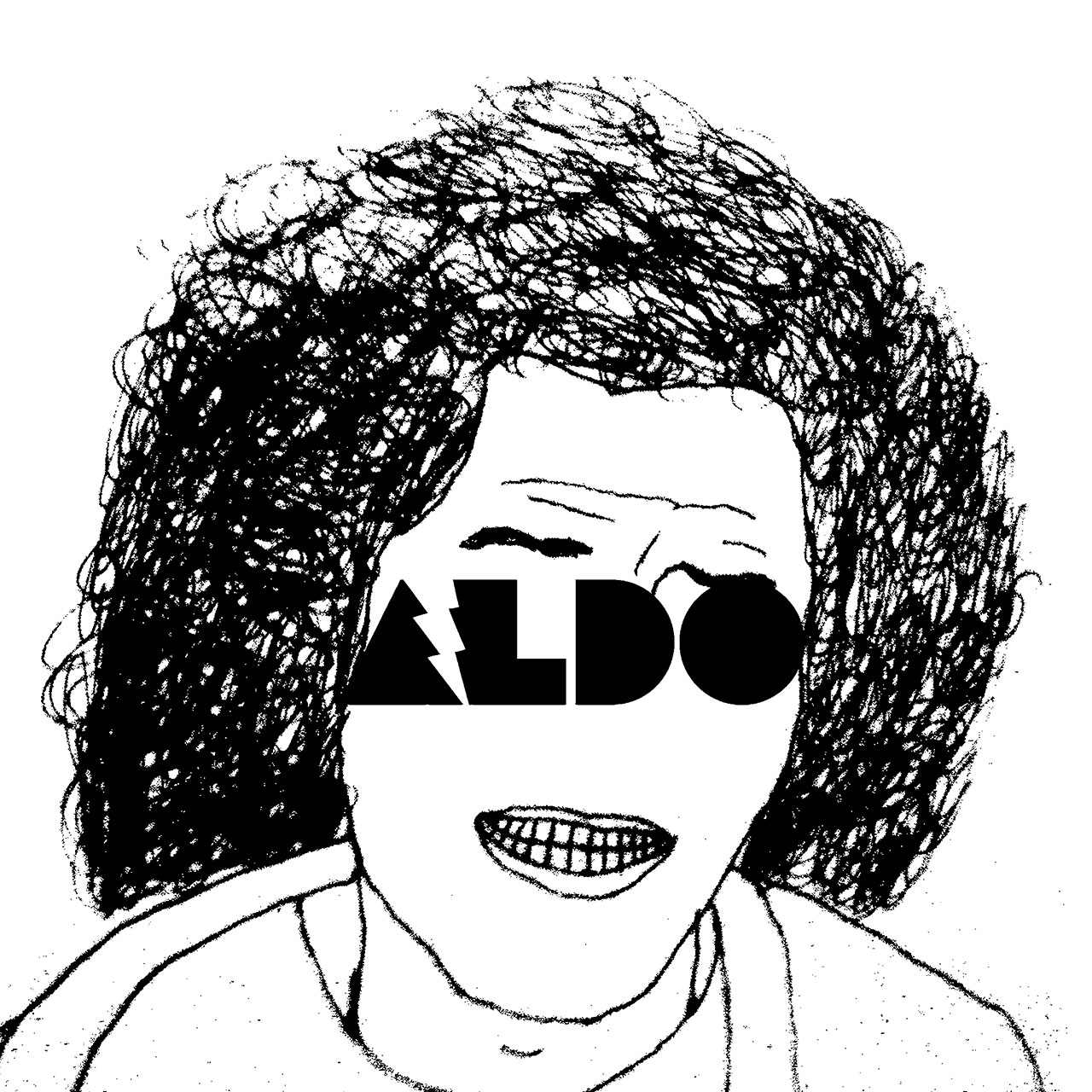
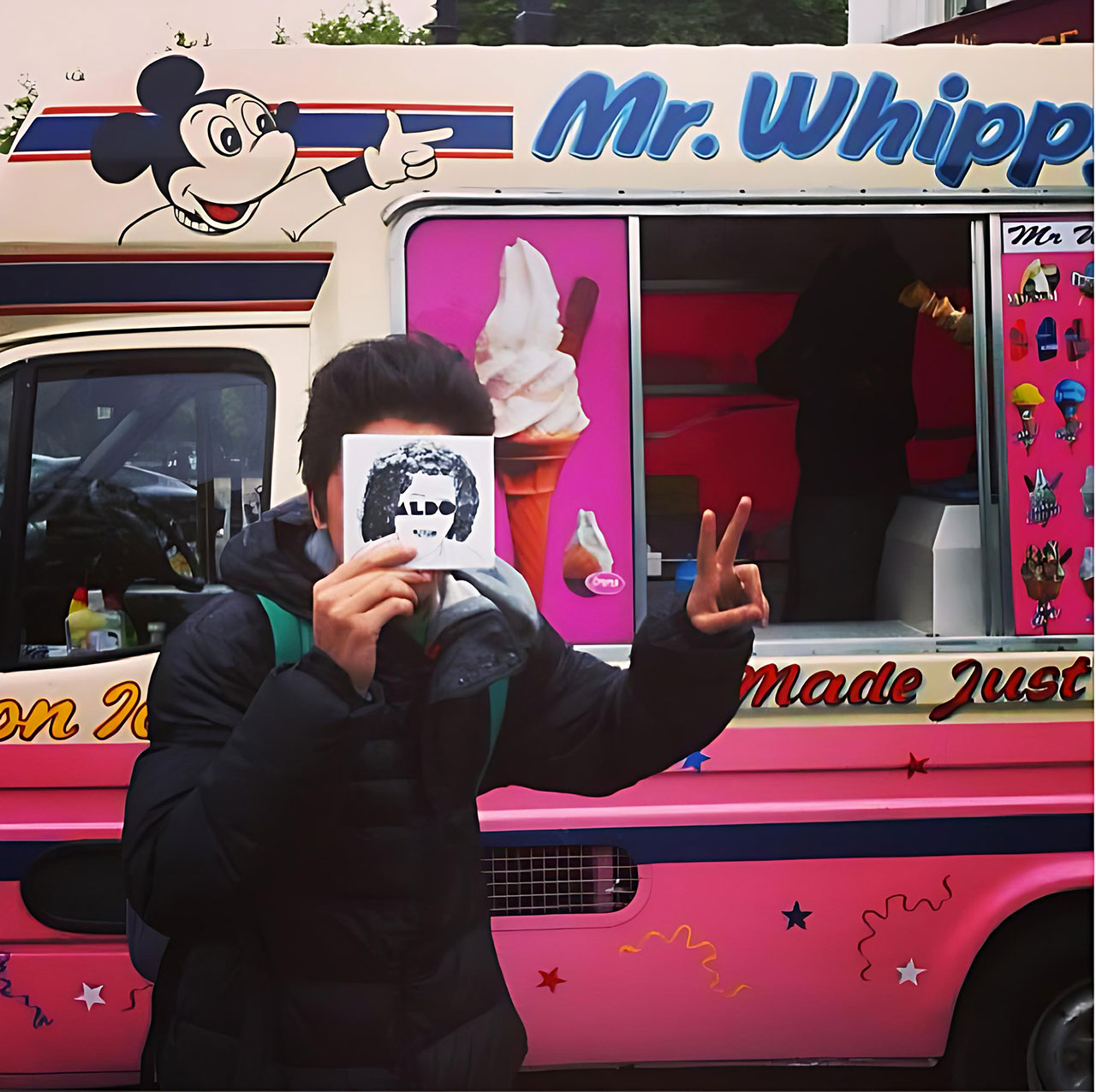
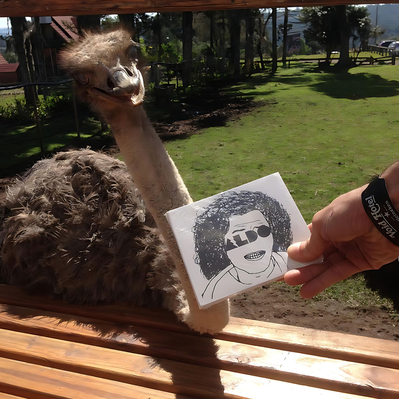
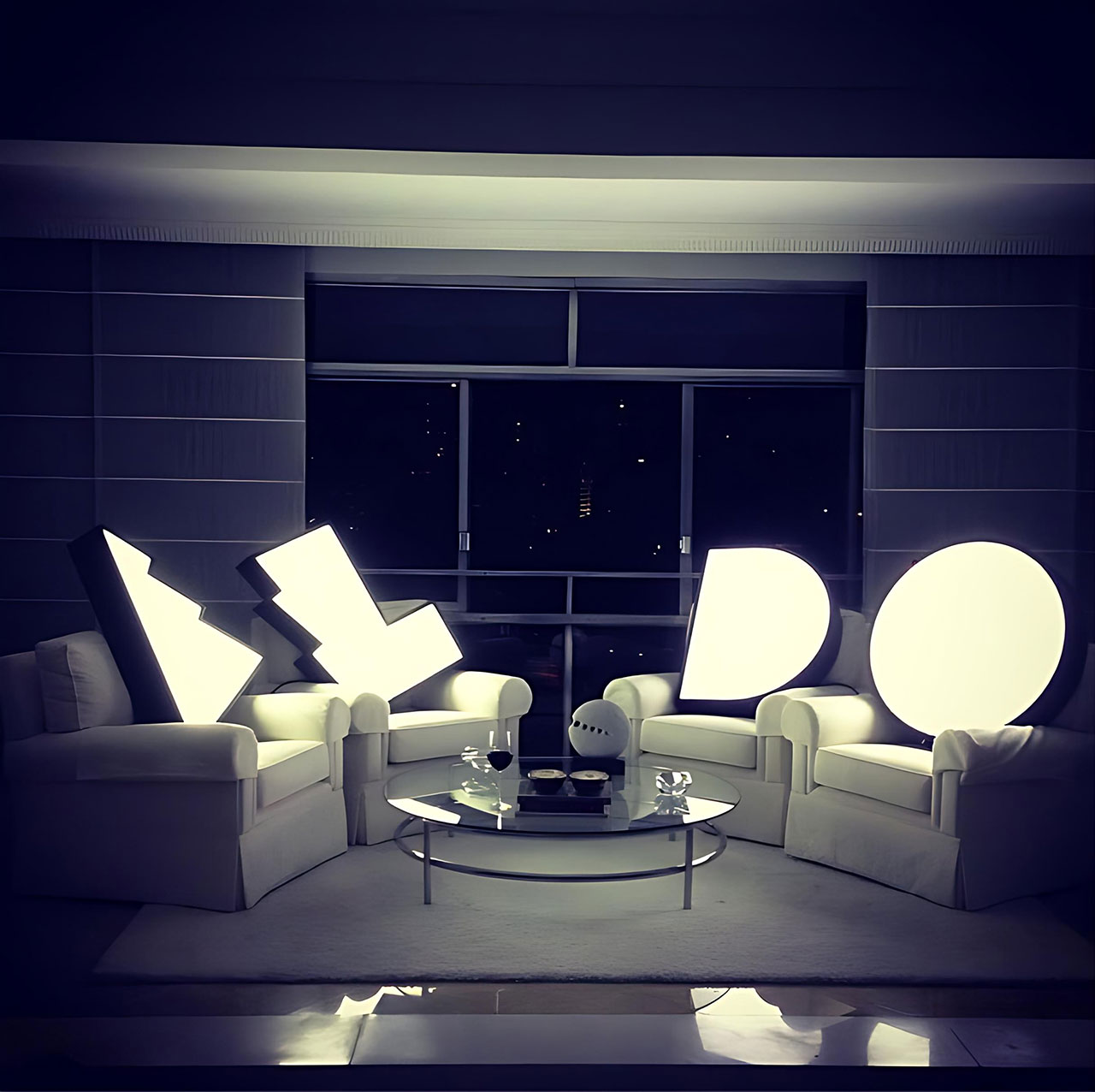
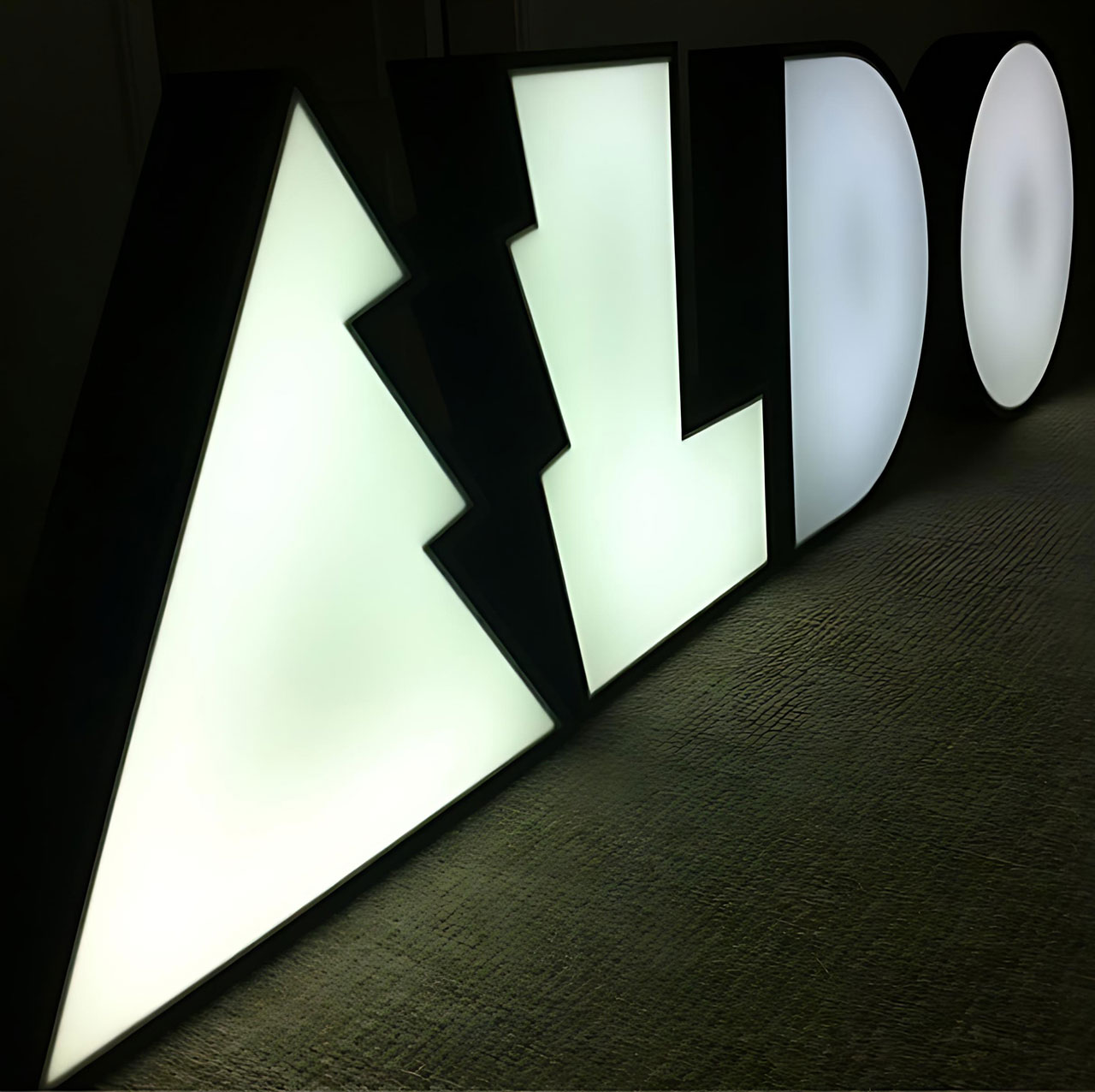
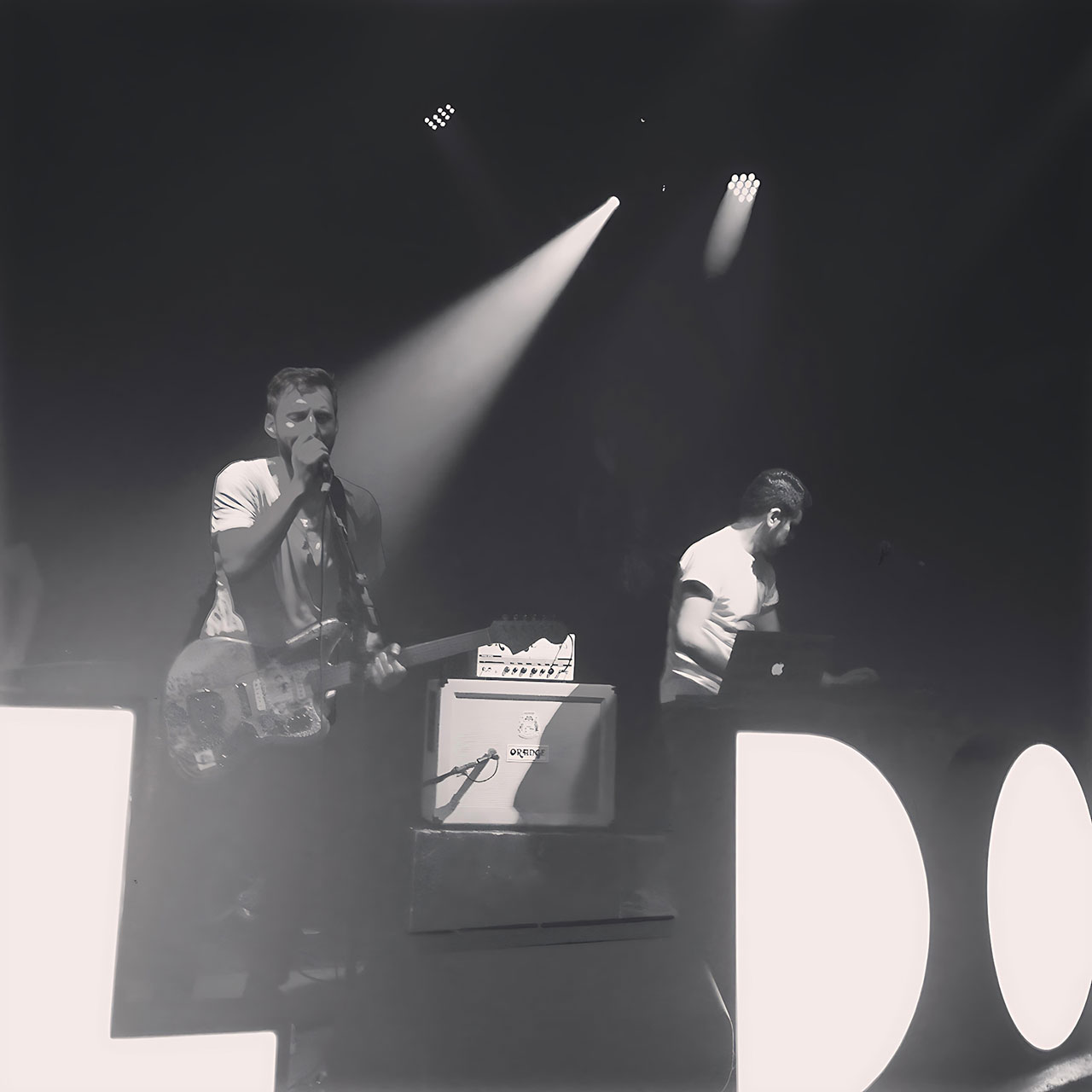
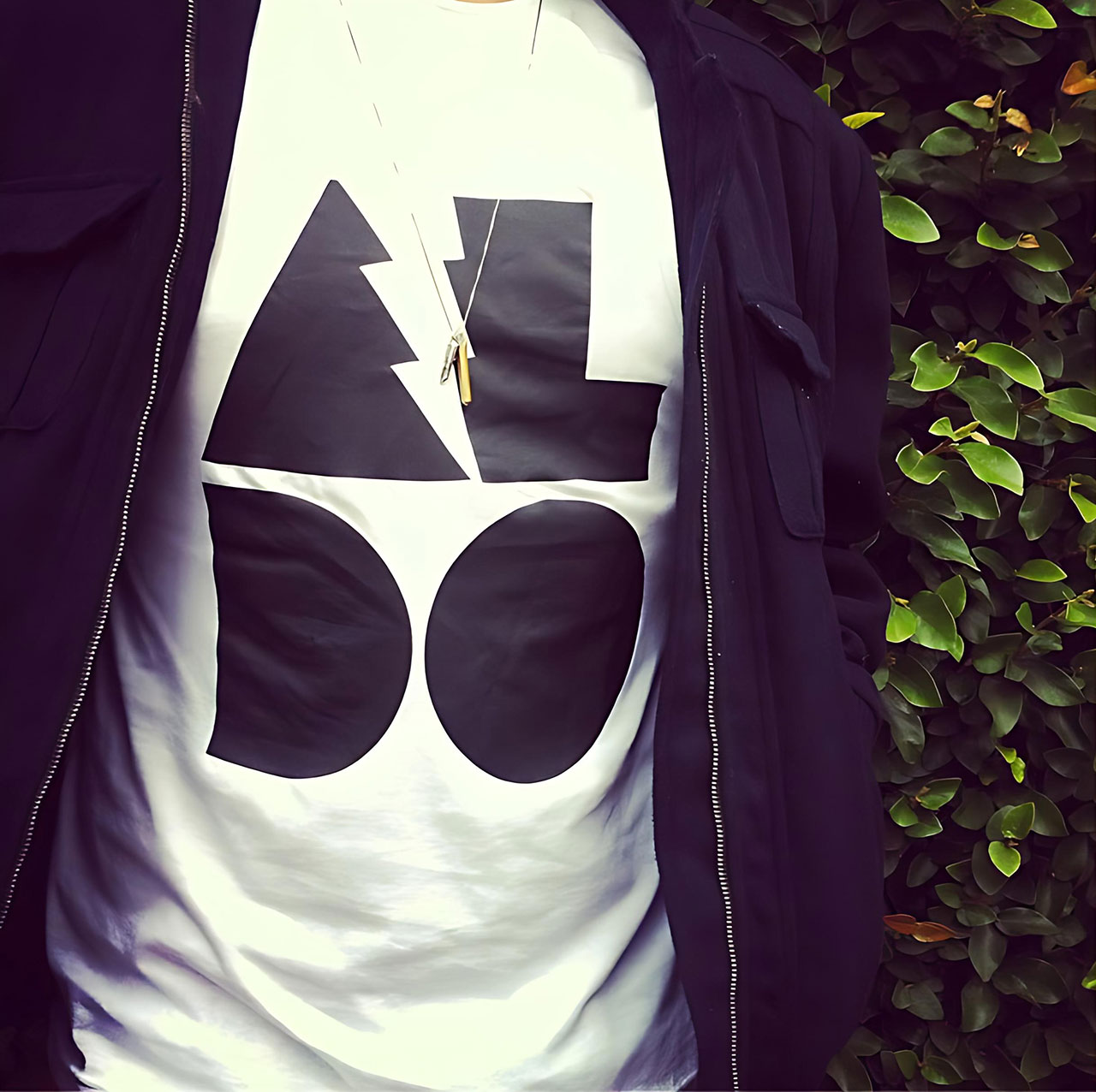
Aldo
2013
–
Role:
Graphic Design
Work done @
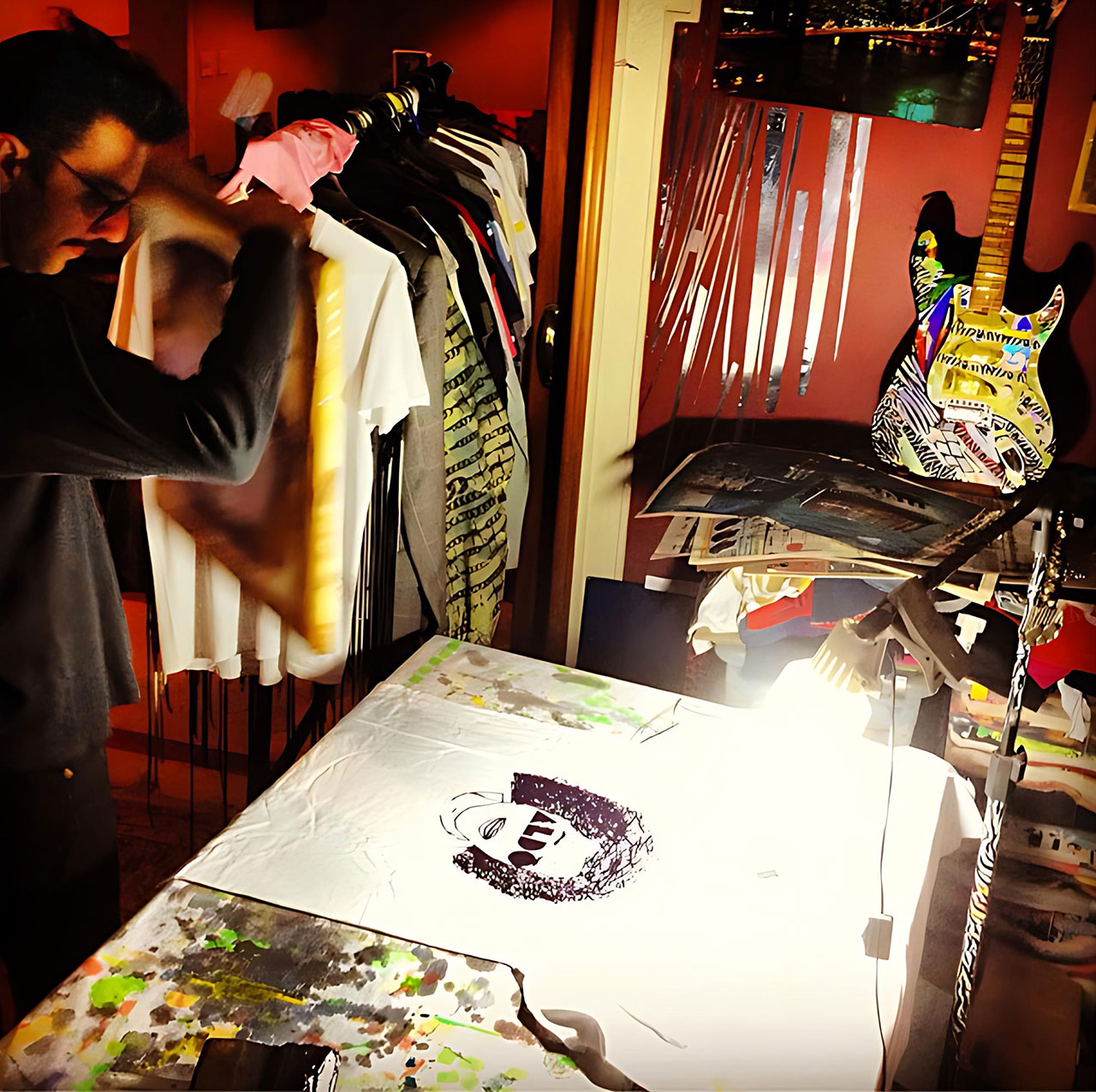
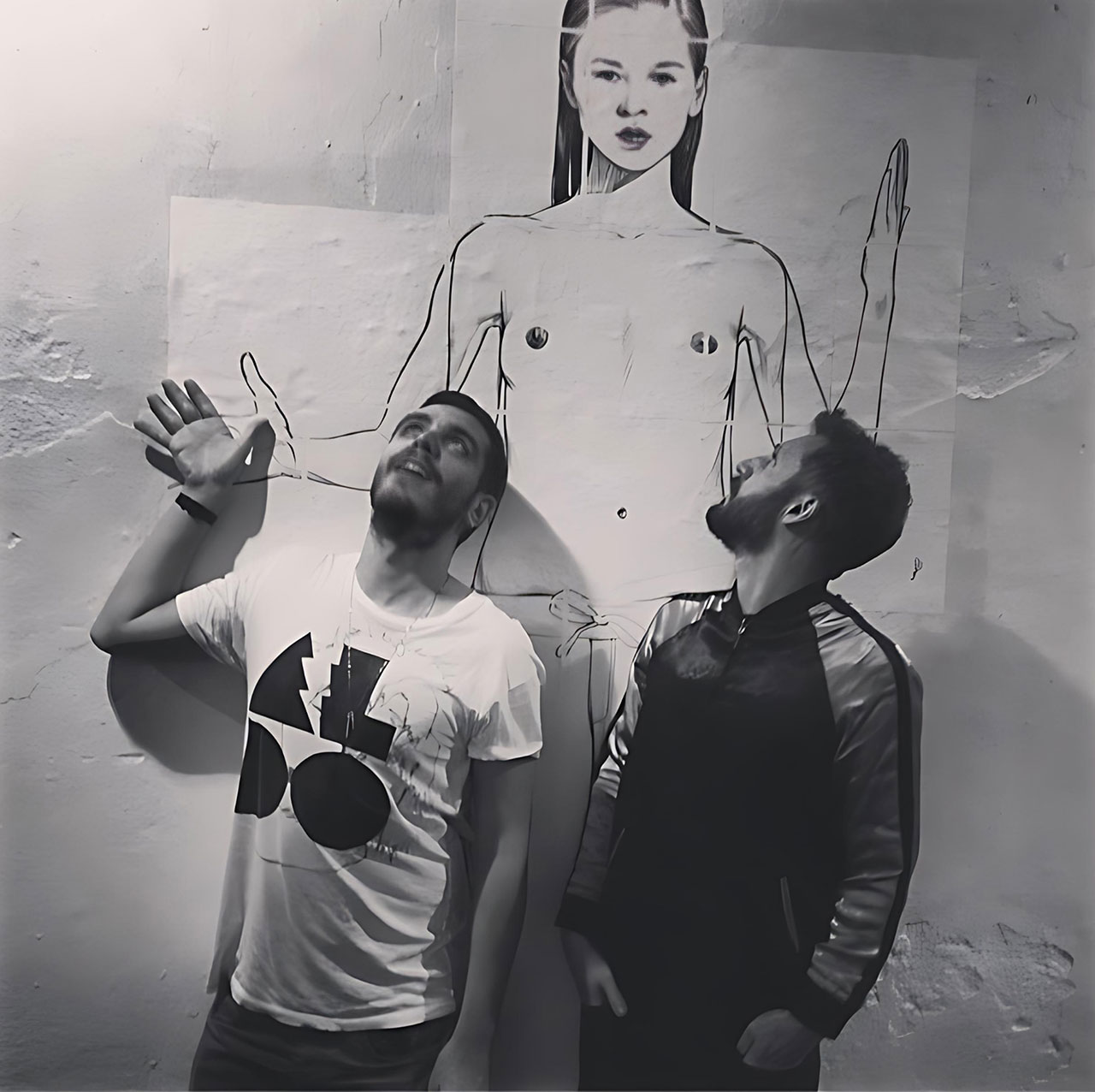
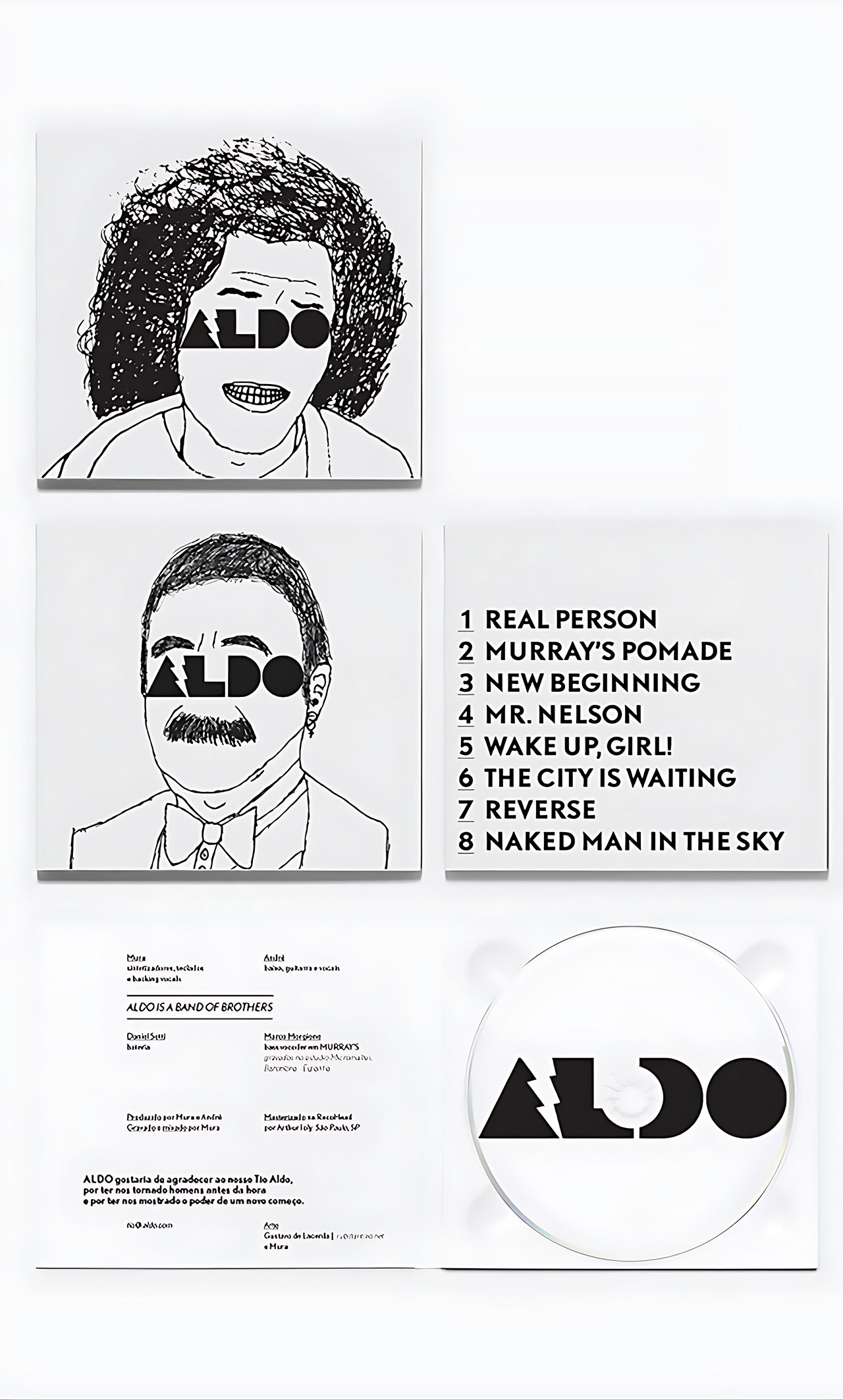
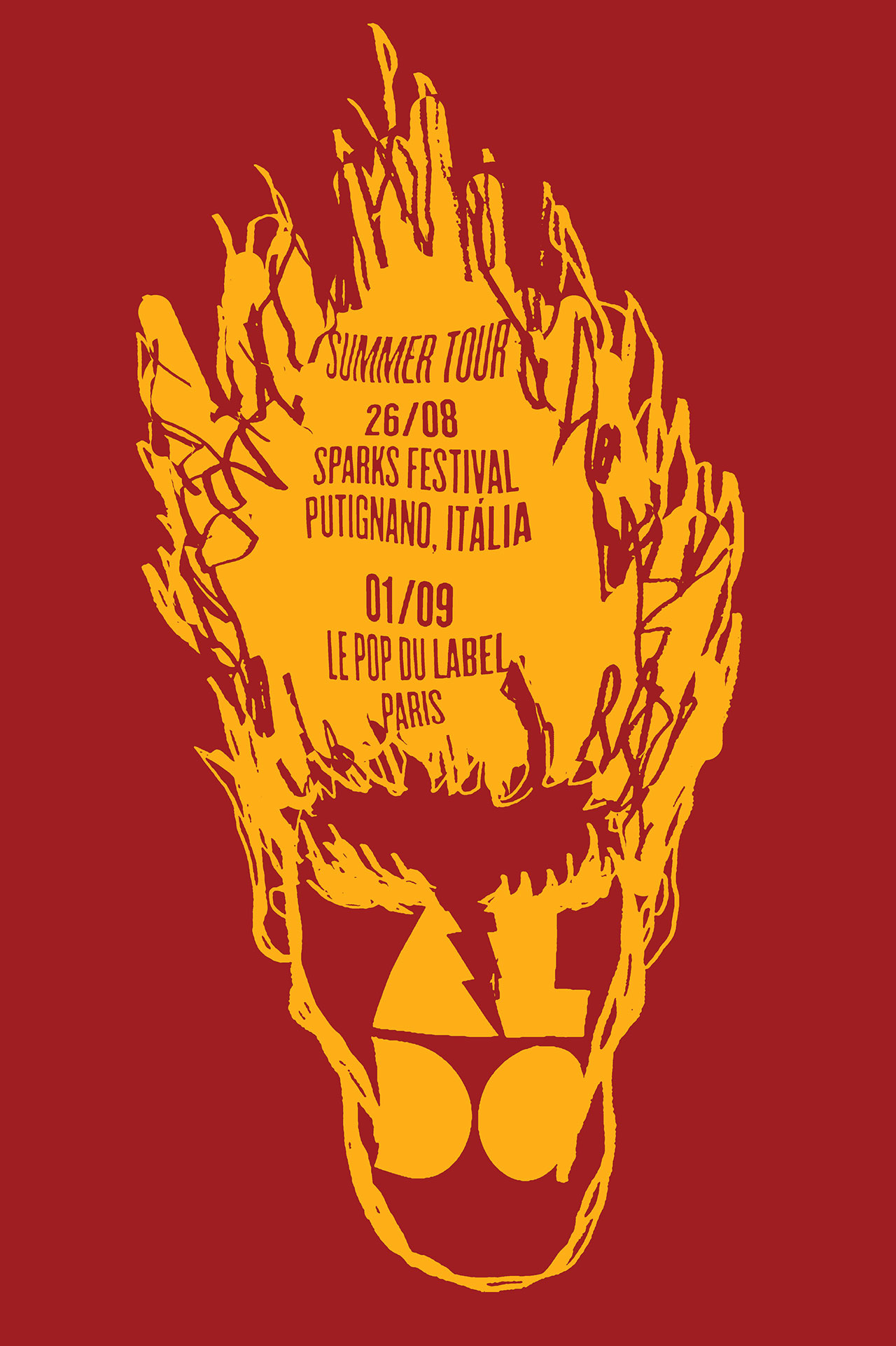
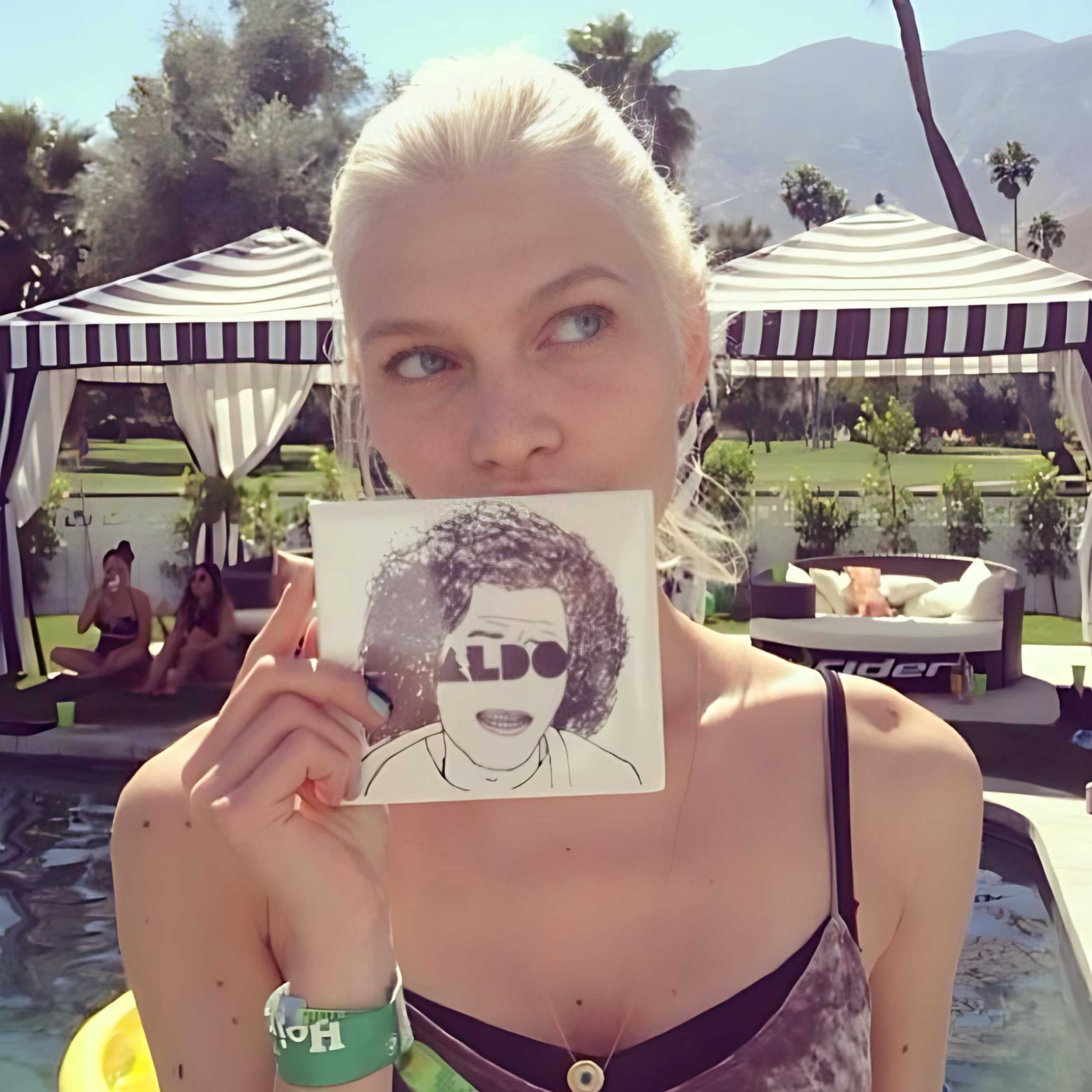
ALDO is a Brazilian sibling duo made up of André and Murilo Faria, who named the band in tribute to their uncle Aldo—a colorful figure who took them on wild, ‘Fear and Loathing in Las Vegas’-style adventures through the nightlife of São Paulo. Their sound, shaped for club culture, combines nostalgic grooves with modern electronic production, creating a danceable indie-electronic aesthetic.
Their logo and visual identity adopts minimal, bold typography, often paired with clean design elements consistent with club visuals, underground culture vibes, paying homage to its DFA influence.
Illustration by Murilo Faria

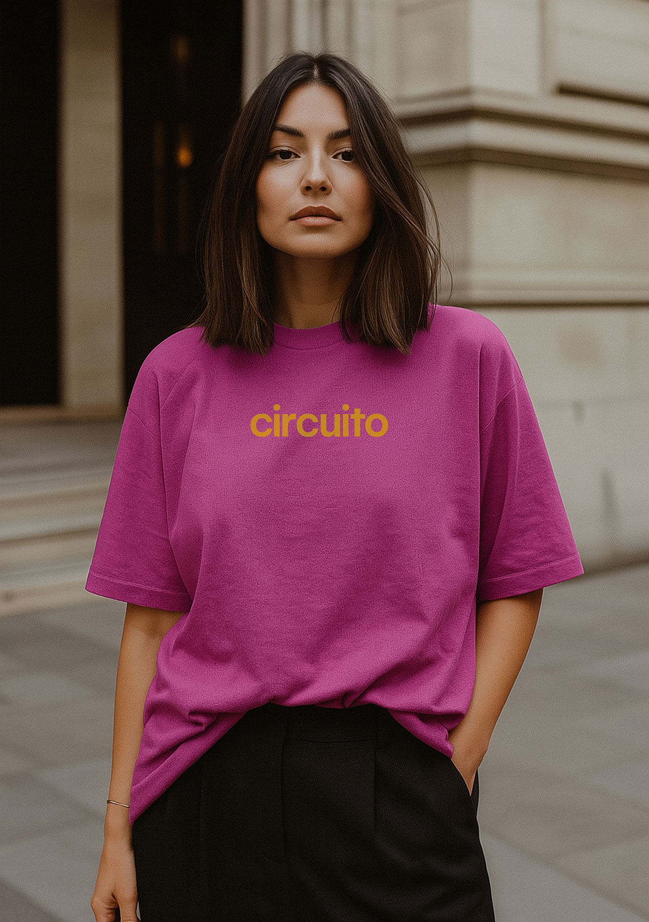
Circuito
2025
–
Role:
Graphic Design
Work done @
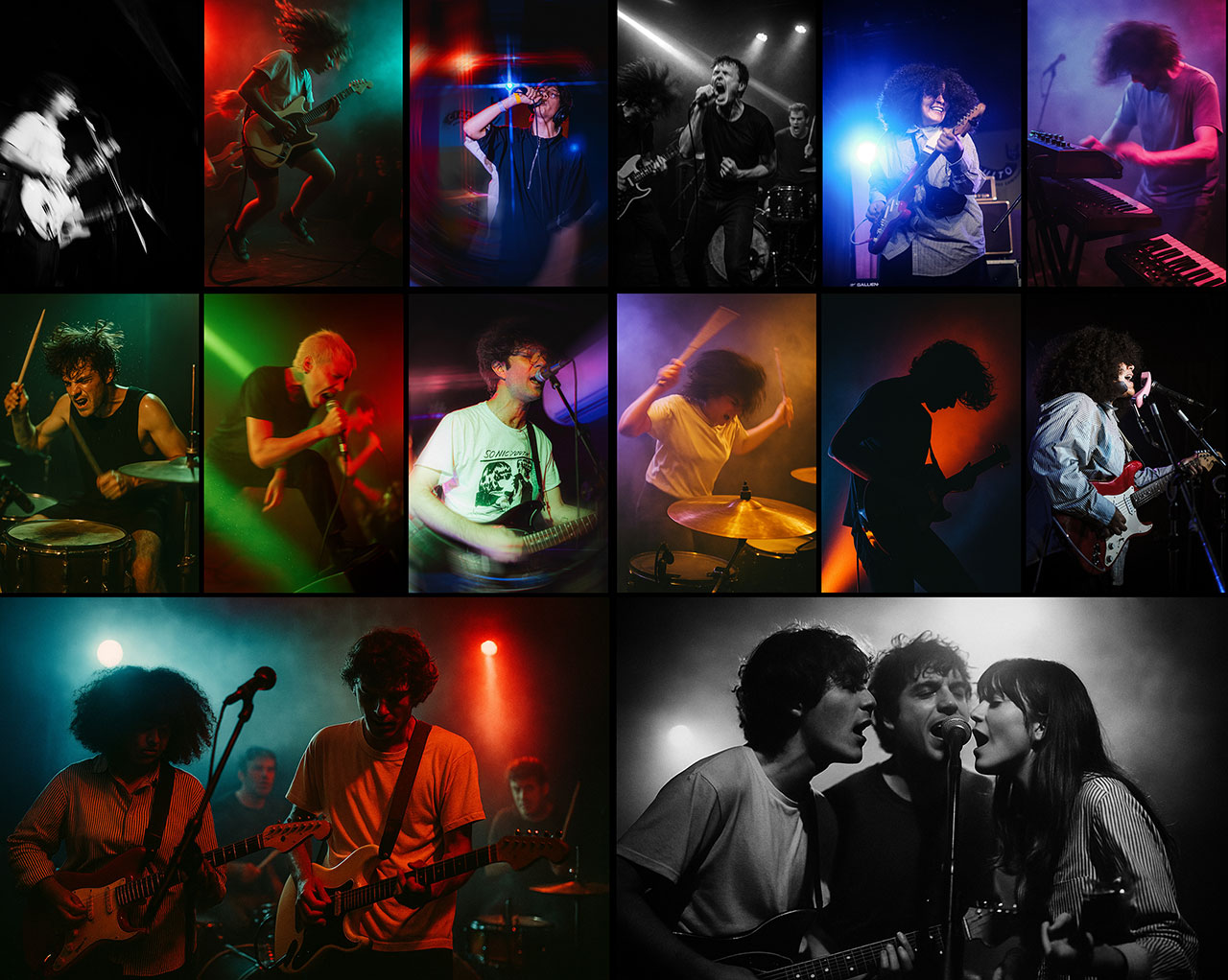
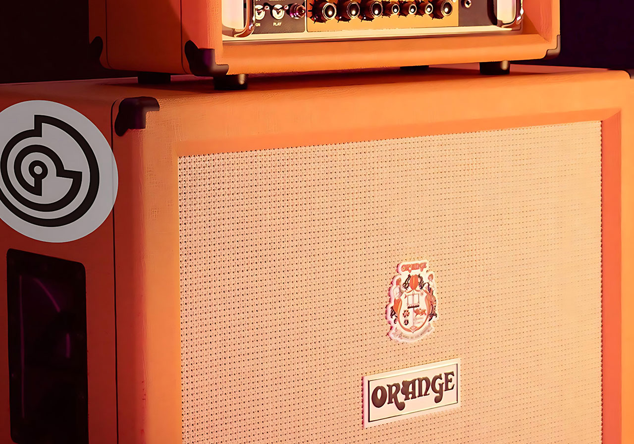
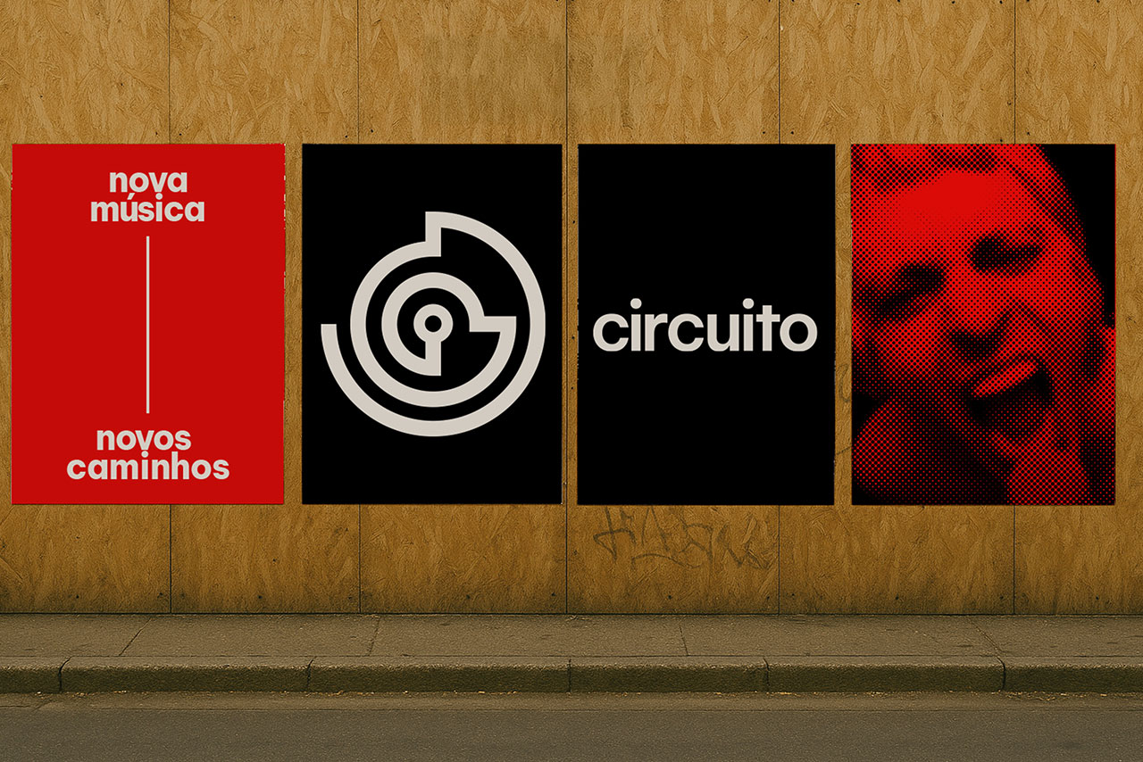
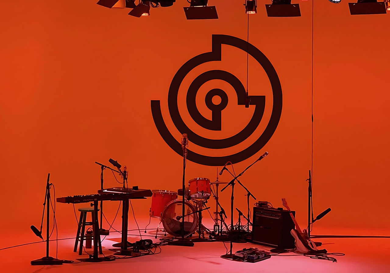
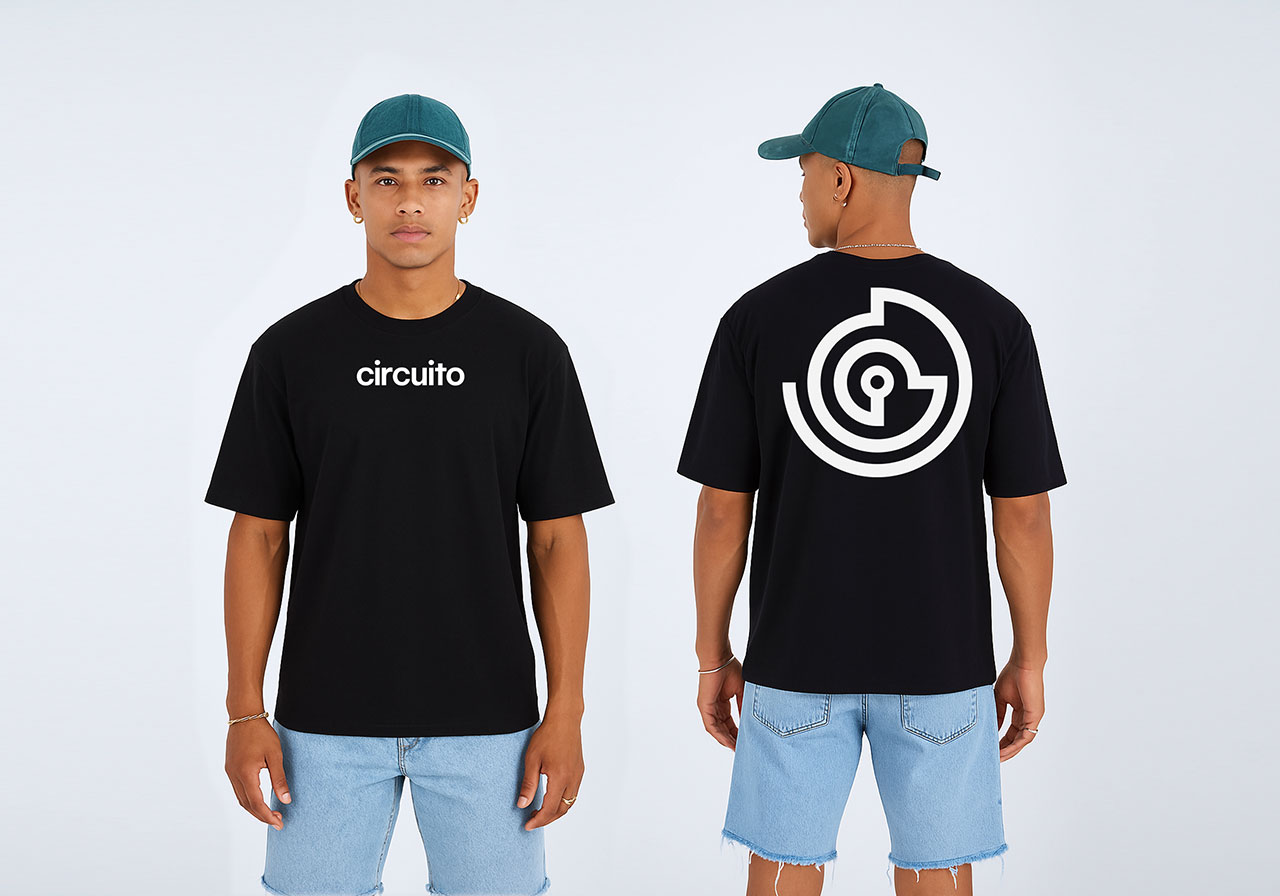
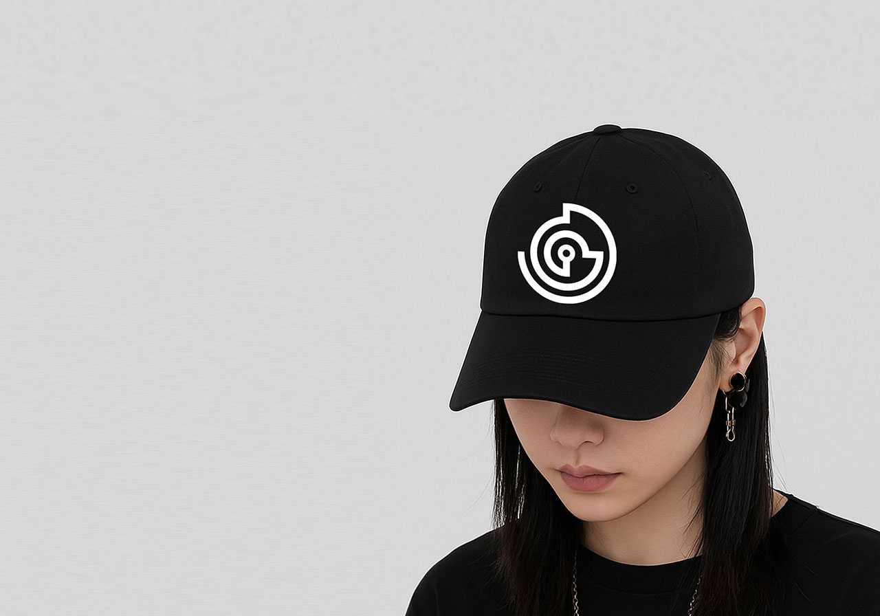
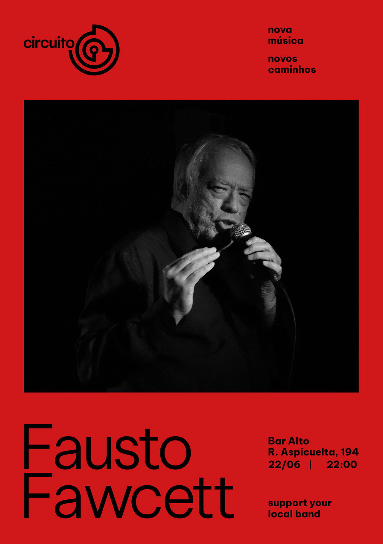
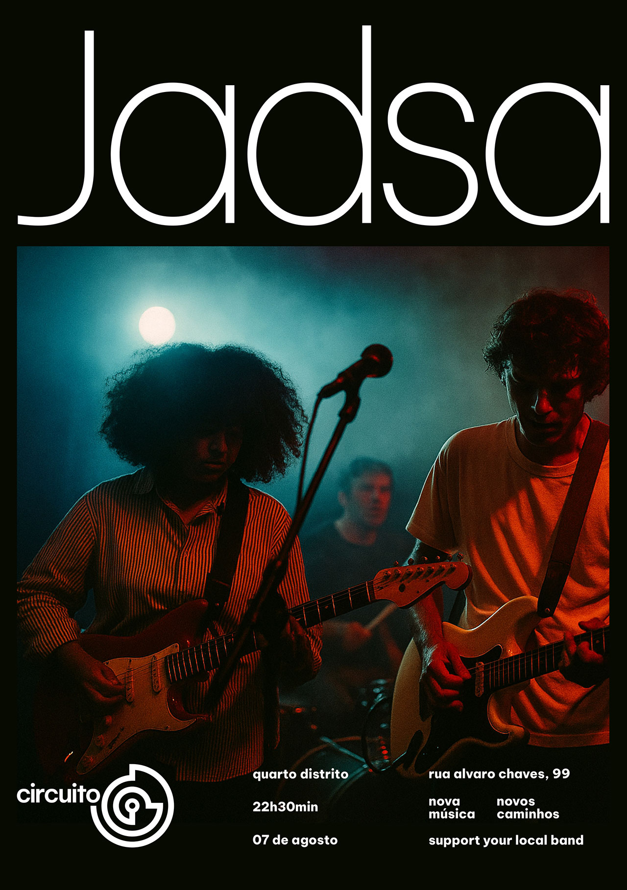
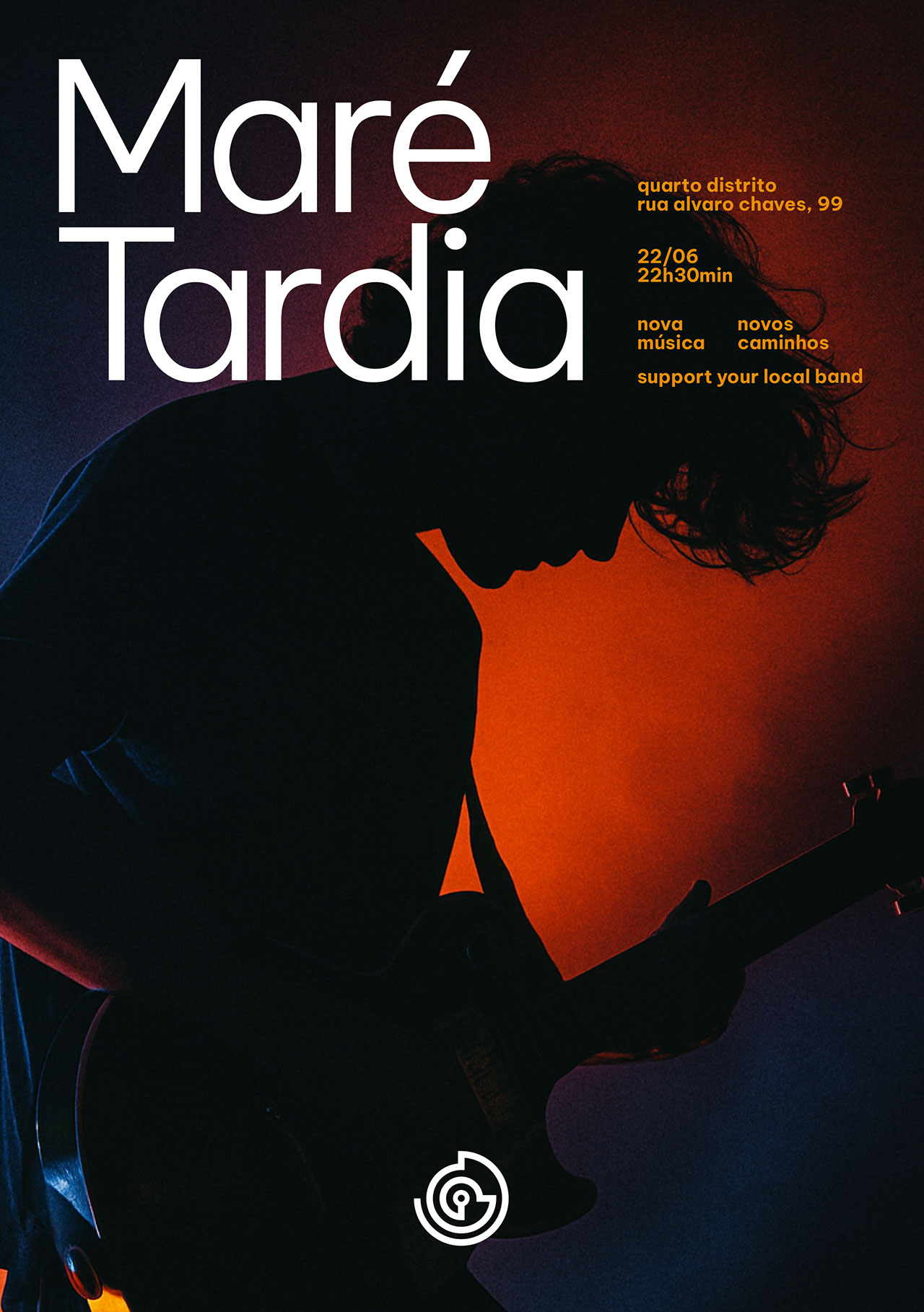
The Circuito Nova Música – Novos Caminhos connects independent artists with diverse audiences in cities across the countryside and the capital of São Paulo, promoting the circulation of Brazil’s new music scene.
Its visual identity embraces editorial minimalism, based on graphic systems associated with contemporary experimental music and the world of institutional visual arts, featuring clear typography and modular organization. The created symbol has multiple interpretationsa labyrinth, a vinyl record, a speaker, or a face with headphones—that reinforce the themes of sound, journey, and identity.
The use if negative space and typographic hierarchy creates a sober and flexible visual, allowing the event’s art to take center stage without competing with graphic elements, ensuring sophistication and consistency for diverse audiences.
Motion by Gabriela Santos

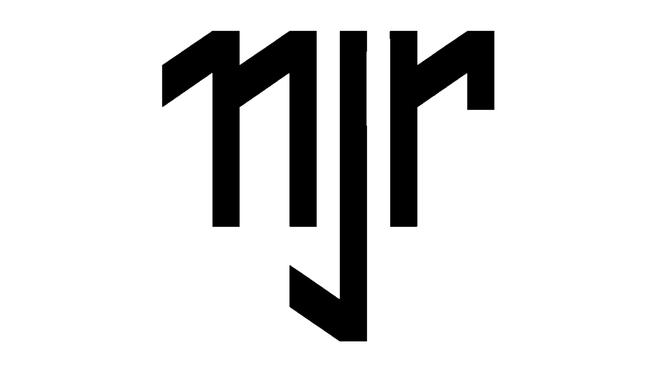
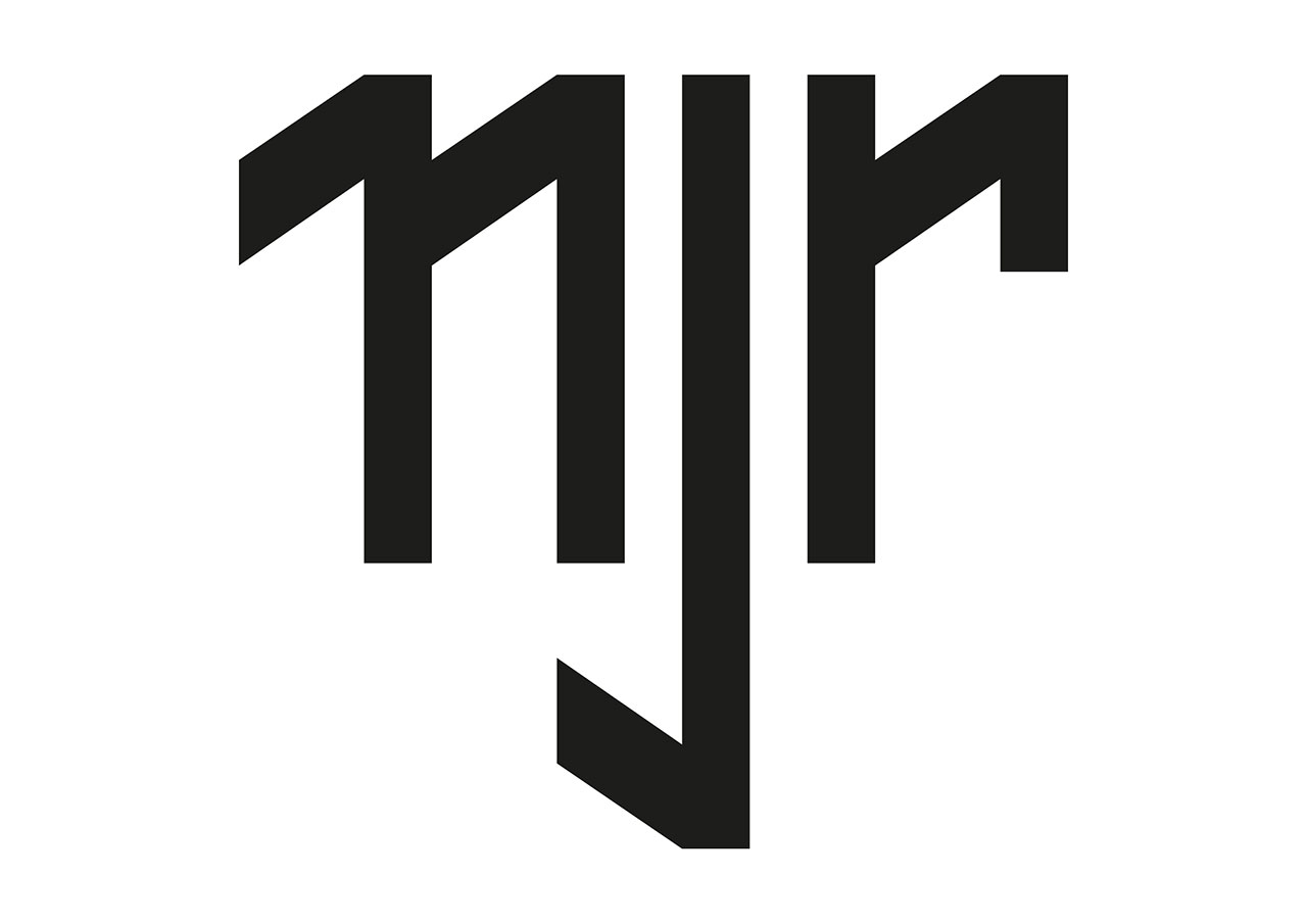
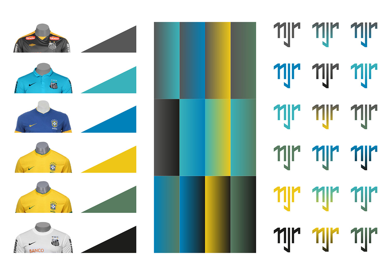
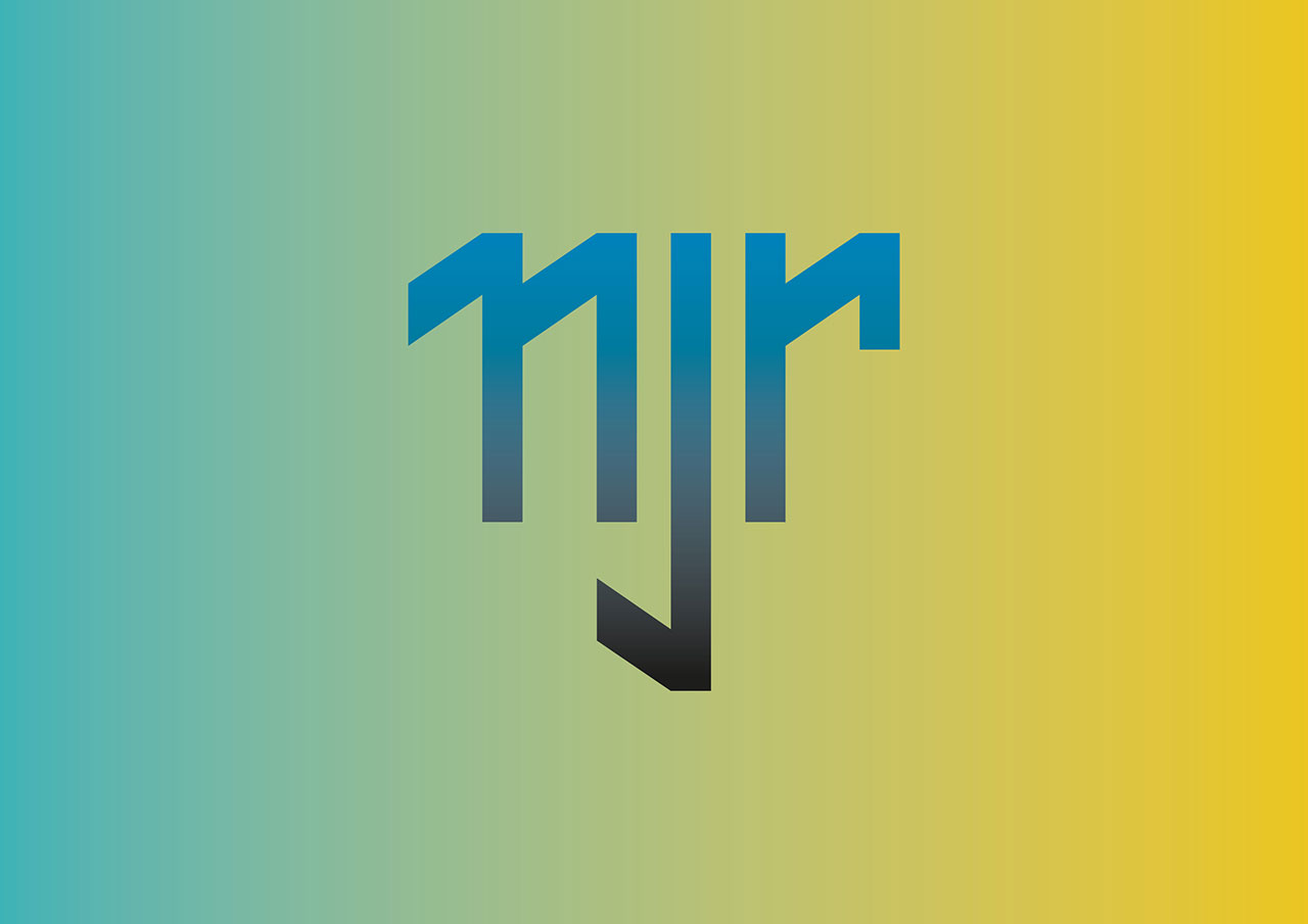
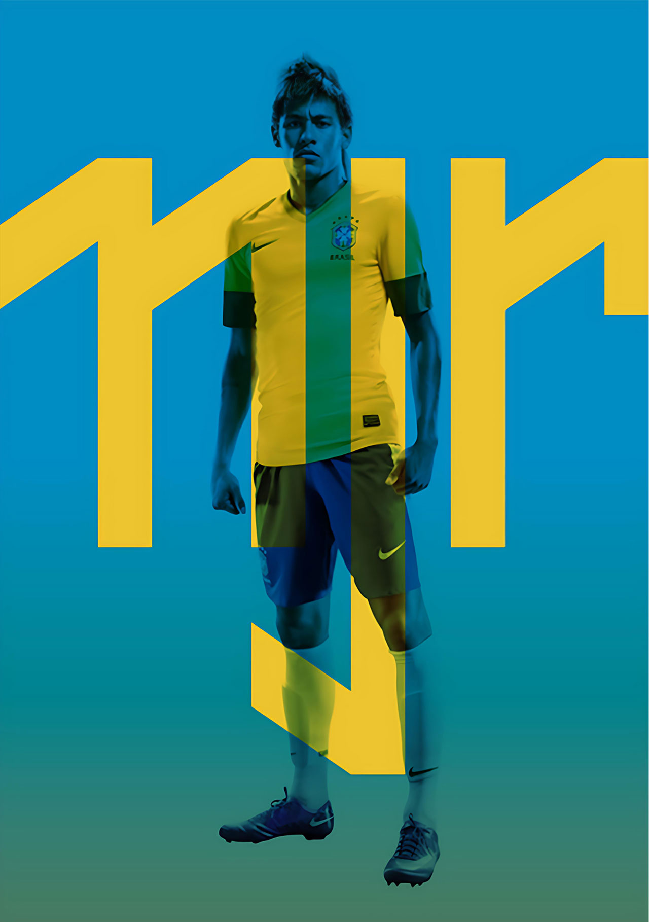
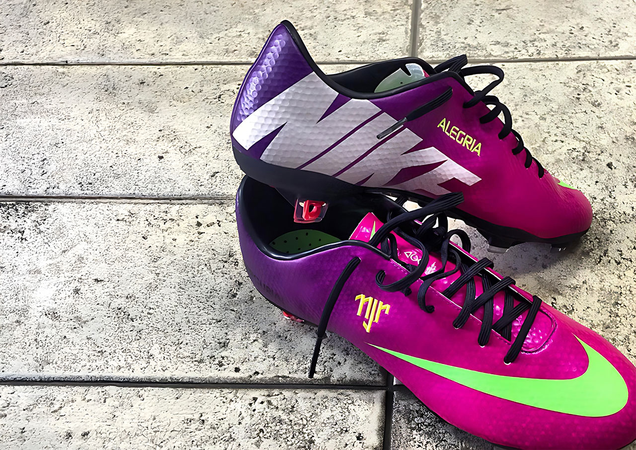
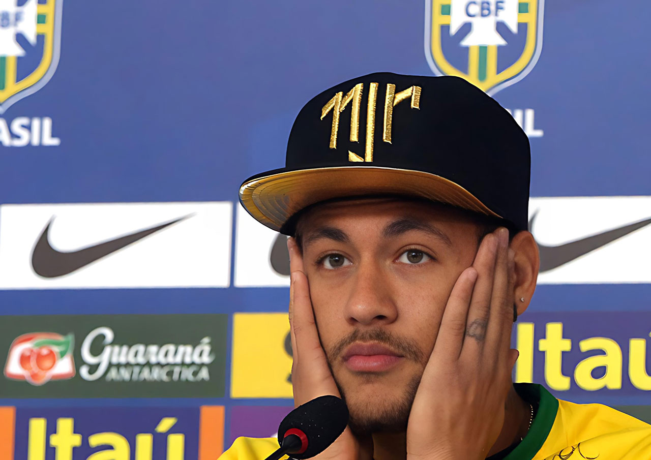
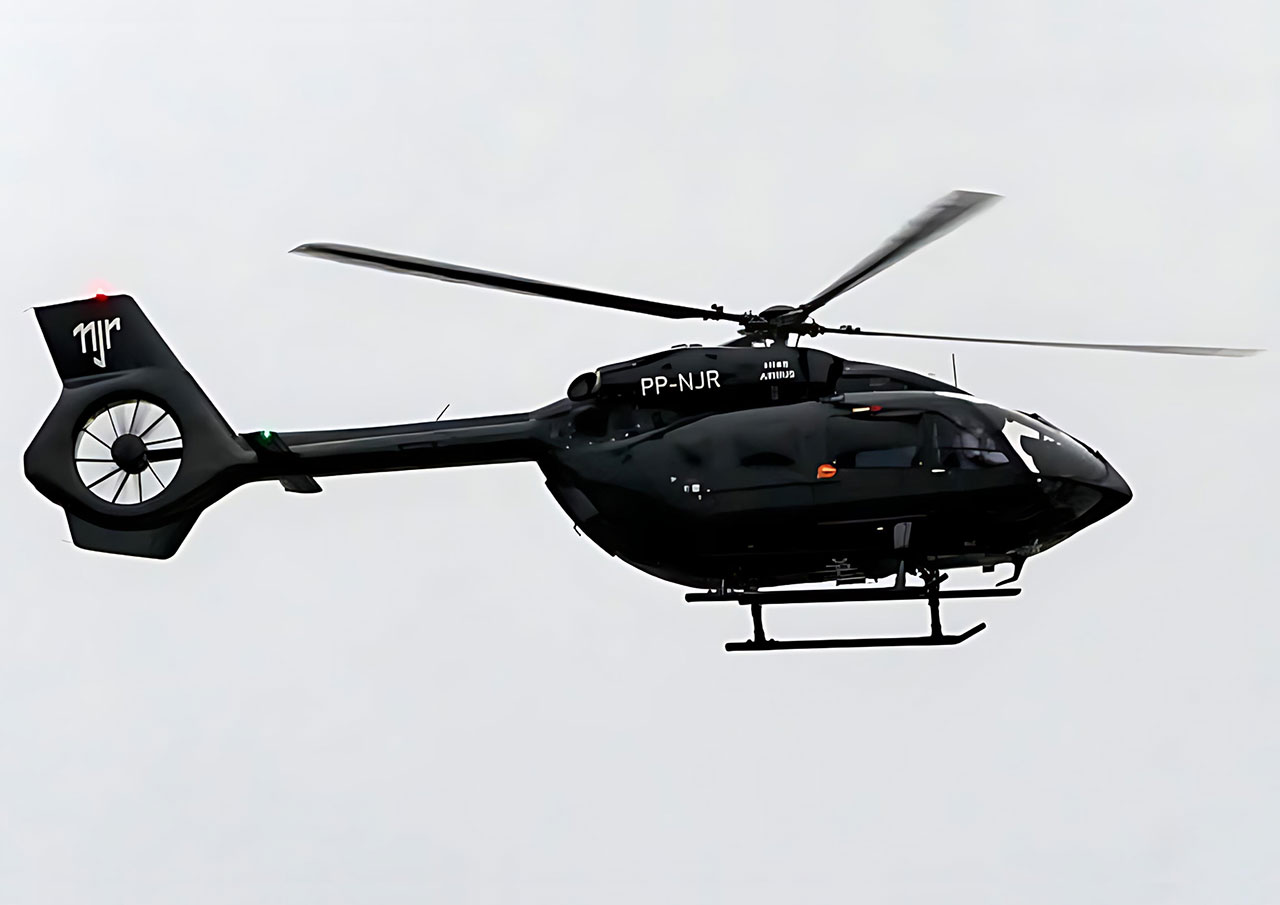
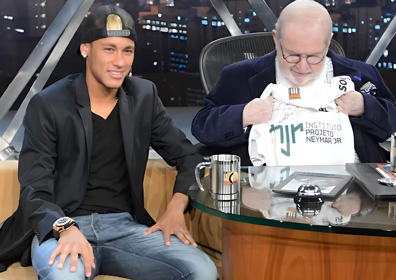
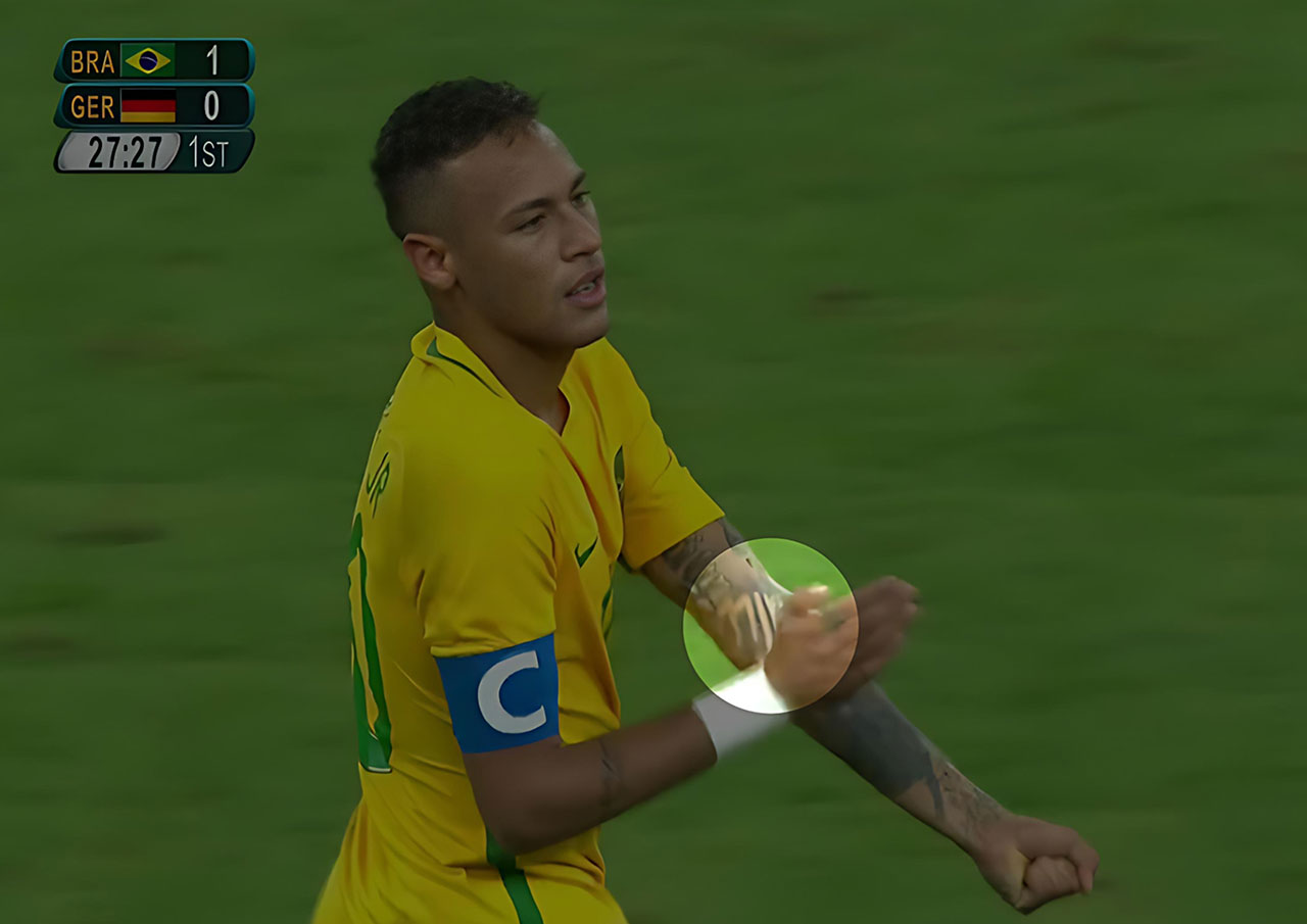
Neymar
2012
–
Role:
Graphic Design
Work done @
Loducca
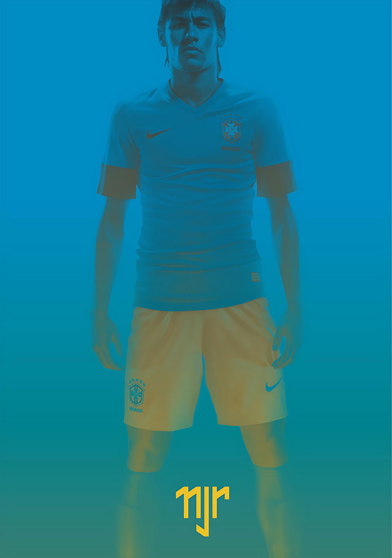
Neymar Jr. created a personal logo to establish himself as a global brand beyond football. As his career took off internationally—especially around 2012, when he was emerging as a rising star at Santos FC and attracting global attention—there was a clear opportunity to build a distinct, marketable identity.
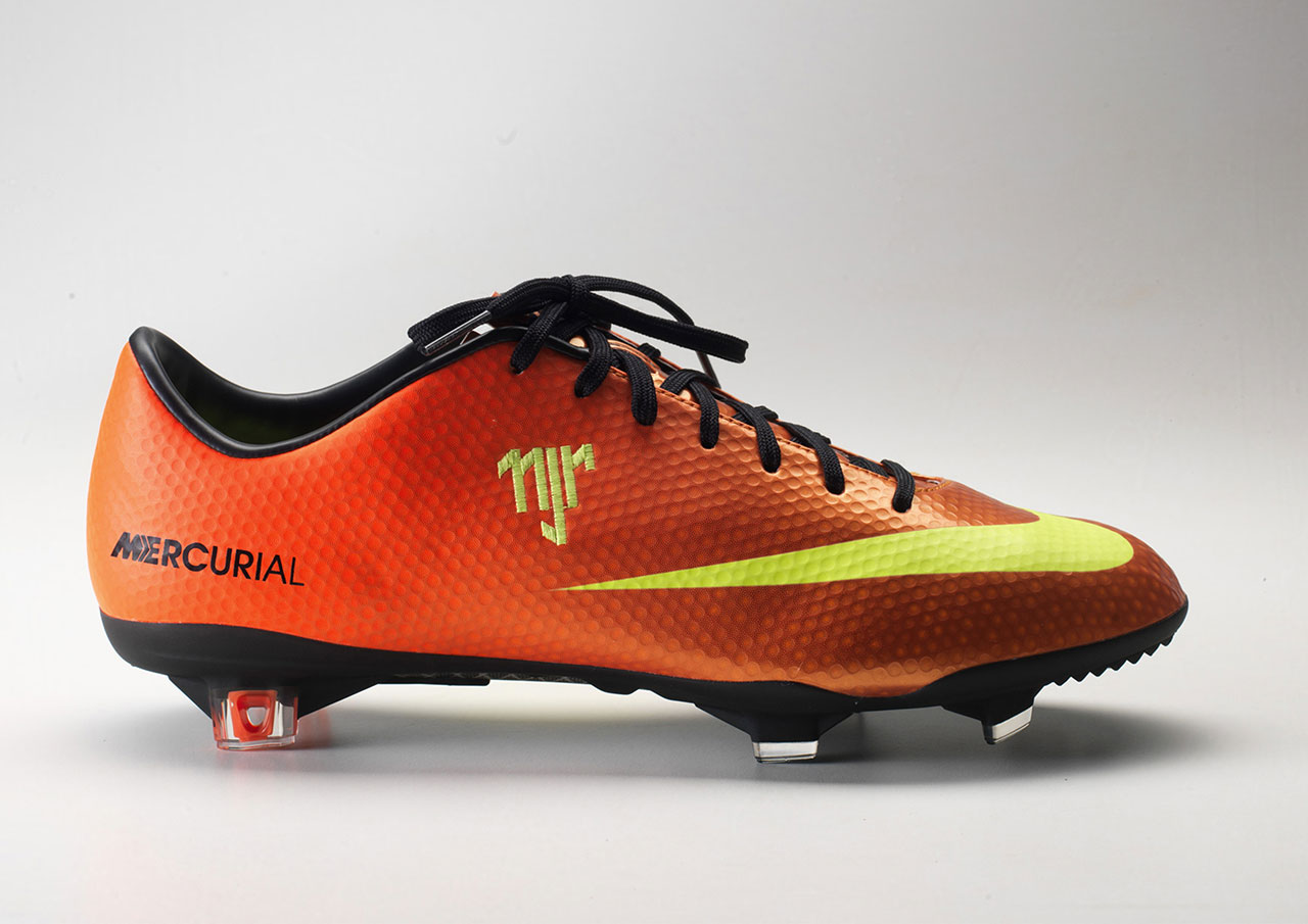
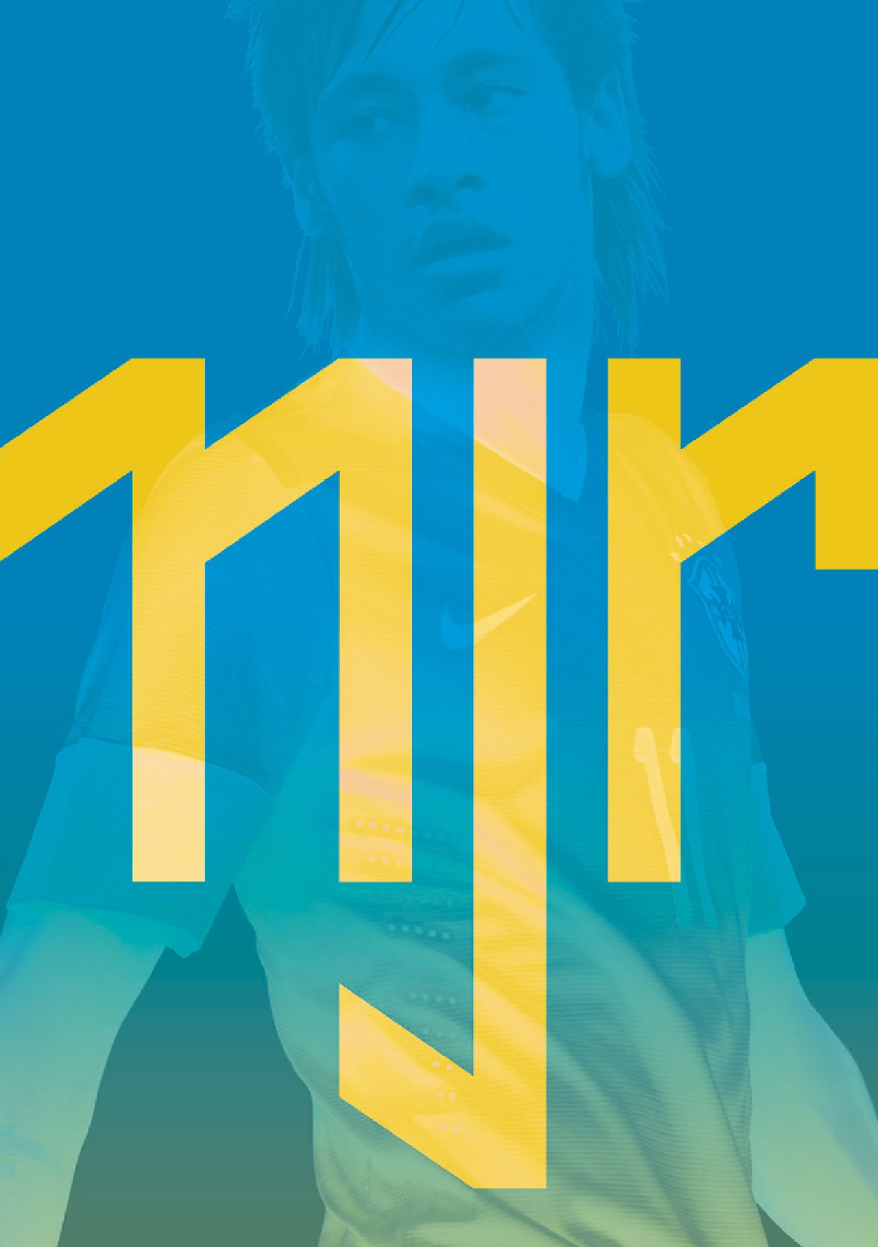
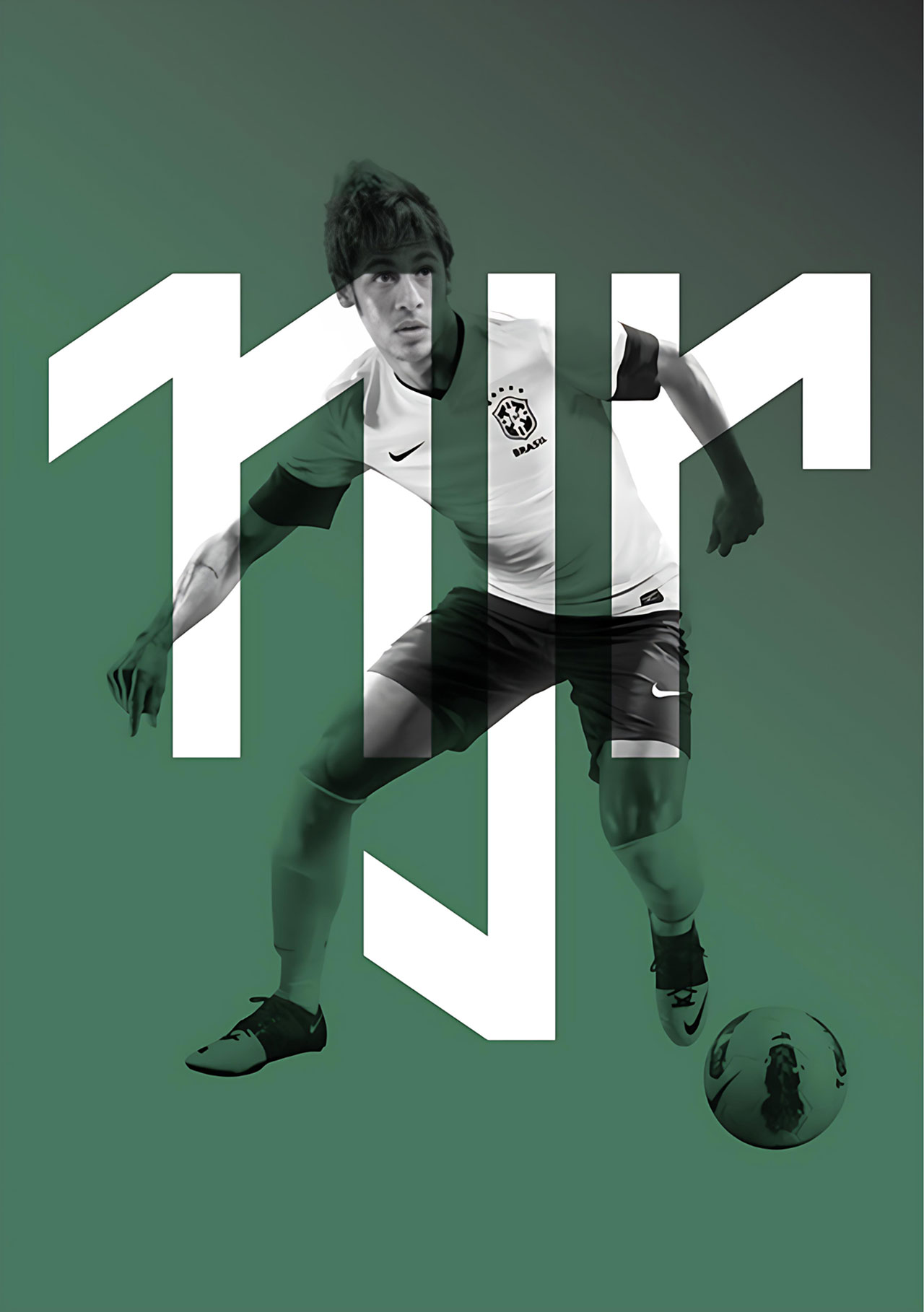
The typographic symbol merges his initials "N", "J", and "R" into a bold and instantly recognizable monogram. The "N" subtly represents the number 11, Neymar’s iconic jersey number, while the vertical alignment and mirrored letterforms create symmetry and balance .
More than a logo, the NJR mark became a symbol of personal branding It reflected his youth, energy, and Brazilian flair, while offering something scalable and versatile—much like logos used by other athlete-icons such as Michael Jordan (Jumpman), Cristiano Ronaldo (CR7), or Roger Federer (RF).